


B2B Web Design Agency
B2B web design is a discipline unto itself. It requires understanding complex buyer journeys, multiple stakeholder personas, and the strategic role a website plays in enterprise sales cycles.
B2b Web Design with Everything Design
Book a call with B2b Web Design Expert
What is a B2B web design agency?
A B2B web design agency designs and builds websites for companies that sell to other businesses — sites engineered to convert considered, multi-stakeholder buyers over long sales cycles, not to drive impulse purchases. It treats the website as a marketing asset: it carries positioning, explains a technical product clearly, builds credibility with enterprise and investor audiences, and gives the marketing team something it can run.
A B2B web design agency typically covers messaging and content strategy, design, and development — because on a B2B site, the words and the structure matter as much as the visuals.
When do you need a B2B web design agency?
You need a B2B web design agency when your website is costing you deals — when it doesn't reflect your positioning, doesn't convert enterprise buyers, or can't be updated without engineering help. The common triggers:
- The site no longer matches how you position the company.
- You're losing or stalling deals because the site doesn't build credibility.
- Your product is technically complex and the site doesn't explain it clearly.
- You're moving into enterprise and need a site that signals it.
- The site is hard to update and leans on developers for every change.
- You have a finished Figma design and need it built with fidelity.
When the product itself is hard to explain, the real challenge is translating a complex product into a clear website — not the visual design.
How to choose a B2B web design agency
Choose a B2B web design agency on strategy, scope, and build quality — not on visual polish alone. Six things to evaluate:
- Strategy before design. Messaging and site structure should be settled before visuals. Ask how the agency decides what each page needs to say.
- One team, full scope. Messaging, design, and development handled in-house removes the handoffs where B2B sites usually break down.
- B2B and category experience. Long sales cycles, technical products, and enterprise or investor audiences are specific. Look for agencies that have designed for them.
- Comparable proof. Ask for sites built for companies at your stage and buyer type — our work for Bizongo, Entropik, and NimbleEdge covers B2B platforms at different stages.
- Process and communication. Look for a structured process, design lock, and regular updates.
- Build quality and maintainability. The build should be Webflow-native, faithful to the design, and handed over so marketers can update it without developers. Ask whether development is in-house or outsourced.
We design B2B websites as marketing assets — diagnosis-first, Webflow-native, motion-enabled, with in-house development so the build never becomes your engineering problem. See our approach to B2B web design and projects like Botim and Relanto. Already past launch and rethinking the whole site? Start with a website redesign.
The Perceived Effort Principle in B2B Web Design: Why Details Signal Value
Every B2B buyer makes a snap judgment about your company within 10-15 seconds of landing on your website. They're not consciously evaluating your design system or noticing that your buttons align perfectly with your grid. What they're noticing—at a subconscious level—is effort.
Did someone care about this? Or was it thrown together?
Perceived effort is the psychological cue that tells a buyer whether your brand is worth their time. It's not about how many hours your design team actually spent. It's about whether the website feels cared for. When buttons match, typography has clear hierarchy, spacing is consistent, and loading is instant—people read that as deliberate attention. And deliberate attention reads as value.
This principle fundamentally changes how you should approach B2B web design. Most B2B companies chase trendy aesthetics or minimalism as an end goal. But minimalism without intentionality reads as lazy. Care without clarity reads as design self-indulgence. The balance is where perceived effort comes alive. Selecting the right B2B website design agency is crucial for businesses aiming to establish a strong online presence and effectively engage their target audience.
Let's break down what this means for B2B web design strategy, how to apply it practically, and where to concentrate your effort for maximum impact.
Why Perceived Effort Matters More Than You Think in B2b Web Design?
In the B2B buying process, trust is the primary currency. A prospect is evaluating not just your product, but whether your organization is stable, competent, and reliable enough to build a long-term relationship with.
A disorganized website immediately signals the opposite: "This company doesn't have their act together."
Research from Google shows that "visually complex" websites are perceived as significantly less beautiful and less trustworthy than their counterparts. But "simple" doesn't mean "unfinished." The distinction matters enormously.
Consider two websites:
Website A: Perfectly minimal. White background, sans-serif font, basic structure. No apparent investment beyond the bare requirements. It feels sterile and budget-conscious.
Website B: Also clean and simple. But the typography has clear hierarchy—headlines breathe, body text is sized for readability, accent colors are used strategically. Spacing feels intentional. Load time is near-instant. Every interactive element (buttons, form fields, toggles) has micro-interactions that feel responsive. There's a subtle gradient used only in a few strategic moments. Images are carefully chosen and optimized, never pixelated or sluggish.
Which company looks like they have standards? Which signals that they sweat the details?
Website B screams competence. And competence is what sells B2B deals.
The Cognitive Load Principle
When your brain encounters a well-designed system, it processes information faster. There's less cognitive friction. You don't have to work hard to understand the page—your eyes naturally follow the hierarchy, your brain knows where to click, your fingers find the button without hesitation.
This ease of processing gets attributed to the brand itself. If the website is easy to navigate, buyers assume the product is easy to use. If the interface is responsive and fast, they assume the company's infrastructure is solid. If the copywriting is clear, they assume customer service is clear too.
This is called the "halo effect" in psychology—one positive attribute influences perception of all attributes.
The inverse is equally true. A site that's slow, confusing, or obviously unfinished creates the opposite halo. It signals carelessness across the entire organization. A B2B web design agency will make sure your website’s content is written and organized in a way that helps buyers learn about your products and services. B2B agencies also know how to optimize your website so that it ranks well in search engines.
The Paradox of Effort: The More Difficult Your Product, the More Effortless Your b2b Website Must Be
This is where most B2B companies get it wrong.
Enterprise software companies—those selling complex, mission-critical tools—often assume their website should be equally complex. They'll load it with detailed feature breakdowns, technical specifications, and dense copy.
But here's the paradox: the more technically difficult your product is in reality, the more your website has to make it look easy.
Think about how Palantir or Stripe present themselves online. Palantir sells data analytics software powerful enough to handle intelligence operations. Their website? Cinematic, confident, visually clear. They show the product in action, but the presentation of it is polished and understated. The difficulty of the product makes it easier to sell—the heavy lifting is already proven by real-world impact (which they communicate through proof, not explanation).
Stripe sells payment infrastructure that's technically complex under the hood. Their website is a masterclass in making difficulty look simple. Clear value propositions. Elegant illustrations. Fast load times. Confident copywriting. You're never drowning in technical details; you're guided through a narrative.
Contrast this with a mid-market SaaS company selling "the next to-do list app" or "a new project management tool." There's been a thousand iterations of this category. The product is incremental. The perceived difficulty is low. So the website has to earn attention through design excellence.
This company has to sweat the details everywhere—micro-interactions, animation finesse, color theory, typography refinement, photography quality. Because without design excellence, there's no reason to choose them over the 50 other options that do the same thing.
Where to Concentrate Your Effort
You can't—and shouldn't—try to be perfect everywhere. That's the path to scope creep, endless iterations, and shipping nothing.
Instead, identify the "moments that matter." These are the interactions and pages where B2B buyers form their primary judgment about your brand.
Moments that matter in B2B web design:
- The Homepage Hero Section – Your first impression. This is where you establish whether the brand is credible, modern, and worth exploring further.
- Product Demonstration & Feature Pages – Where skeptics become believers. This is where you prove the product works. Visual clarity here is non-negotiable.
- Trust & Security Section – SOC 2 badges, certifications, integrations, client logos. These elements signal legitimacy. The presentation of these signals matters as much as the signals themselves.
- Conversion Points (CTAs, Forms, Pricing) – Where friction exists, attention is required. Every form field, button state, and confirmation message should feel intentional.
- Performance (Load Speed, Responsiveness) – This isn't about heroic web development. It's about not wasting your buyer's time. A 6-second load time will destroy your conversion rate.
These five moments define your website's perceived effort. Go overboard here. Make the interface respond instantly. Animate buttons with purpose. Use photography that's clearly been sourced, edited, and positioned with care.
Where You Can Be Pragmatic:
- Case study landing pages (as long as they follow the proven framework)
- Blog content and educational resources (clear writing > perfect design)
- Internal pages deep in your site structure (people who reach these have already bought in)
- Localized or regional variations (maintain consistency, but don't duplicate effort unnecessarily)
This isn't laziness. It's strategic. You're concentrating perceived effort in the moments where B2B buyers are actually evaluating your brand.
The Three Layers of Perceived Effort in B2B Web Design
Layer 1: Visual Coherence
This is where perceived effort begins. It's the baseline signal that you care about details.
Visual coherence includes:
- Typography hierarchy: Are headlines, subheadings, and body text clearly distinguished? Can a reader scan the page and understand what matters in 3 seconds?
- Color consistency: Is your palette intentional, or does it look accidental? Colors should reinforce your brand strategy—not arbitrary. In B2B SaaS, color is a primary signal of personality. Whimsical uses pastels and gradients to signal playfulness and collaboration; an enterprise security tool would signal confidence and stability through darker, more reserved tones.
- Spacing and alignment: Does every element have breathing room? Or does content feel cramped? Inconsistent spacing immediately signals a lack of design discipline.
- Logo and brand asset usage: Are your distinctive brand assets used consistently? Or does each page invent its own approach? Consistency + distinctive assets = 52% higher salience (top-of-mind awareness).
The action: Conduct a visual audit. Visit your competitor's homepage, then yours. Which one immediately feels more intentional? Now ask: what's the difference? Is it color consistency? Tighter spacing? Better typography?
Even small improvements here—fixing inconsistent heading sizes, tightening spacing, ensuring color consistency across pages—creates a noticeable shift in perceived effort.
Layer 2: Interaction Responsiveness
This is where perceived effort becomes felt.
Buttons that instantly highlight when hovered. Form fields that show validation in real-time. Page transitions that feel smooth instead of jarring. Loading states that reassure instead of confusing.
These micro-interactions are where B2B web design stops being passive (something you look at) and becomes active (something you interact with). A sluggish button, a form field that doesn't respond to input, a page that loads in chunks—these are moments where you lose perceived effort points.
Research shows that a one-second delay in page response can result in a 7% conversion decrease. But more importantly, it feels like incompetence. The buyer's subconscious reads it as: "This company can't even get their website to load smoothly. How am I supposed to trust them with my data?"
The action: Audit your key interaction points. Test form submission, button states, hover effects, page load times. Use tools like GTmetrix or Google PageSpeed Insights. Identify where friction exists. Focus there.
You don't need animations everywhere. You need animations where they matter. A button that confirms a click with a subtle color shift. A form field that validates as the user types. A loading indicator that's elegant instead of boring.
Layer 3: Trust Signals Presented With Care
In B2B, trust signals matter more than clever design. Client logos, certifications, case studies, social proof—these are the primary drivers of B2B conversion.
But how you present these signals directly impacts whether buyers believe them.
A cluttered wall of 40 customer logos looks desperate. A curated selection of 8-12 logos, with generous spacing and clear visual hierarchy, signals selective, high-quality partnerships.
A case study buried on a secondary page might as well not exist. A case study presented prominently with:
- Clear headline
- Specific metrics and outcomes
- Visual representation of the problem/solution
- Client name and industry context
...becomes social proof that actually works.
The action: Audit your trust signals. Are they presented with care, or crammed onto a page? Do your customer logos have room to breathe? Are your certifications positioned prominently or hidden in fine print?
Often, just repositioning your existing trust signals—moving them above the fold, giving them more space, presenting them with better design—increases their perceived impact.
B2B Web Design Principles for Different Product Types
1. High-Innovation Products (AI, Deep Tech, Enterprise Infrastructure)
Perception challenge: "Is this too complex for us to understand?"
For these products, your website can be visually sophisticated. You're not selling commodity software; you're selling breakthrough technology.
Perceived effort strategy:
- Use cinematic presentation: video demos, product-in-action footage, real customer implementations
- Make the complexity feel controllable through clear information architecture. Show how many configuration options exist, but make the "getting started" path obvious.
- Lean on authority signals: technical certifications, notable customers, research papers or thought leadership
- Invest in high-quality product visuals: real screenshots > stock illustration; real UI > sanitized mockups
Example: Palantir's website communicates enterprise mission-critical power through serious, cinematic design. Stripe's website communicates technical power through elegant, minimalist presentation. Both signal "we've thought deeply about this."
2. Mid-Market SaaS (Project Management, CRM, Collaboration Tools)
Perception challenge: "How is this different from the 20 other tools in this category?"
For these products, the perceived effort is your primary differentiator. The product itself may not be revolutionary, but if the website feels deliberate and crafted, it signals a company that cares about details.
Perceived effort strategy:
- Invest heavily in micro-interactions and polish. Responsive buttons, smooth transitions, fast load times.
- Use a consistent, distinctive visual system. Unique color combinations signal difference better than individual colors.
- Show real implementation scenarios: how teams use the product in context, not abstract feature overviews
- Detail matters here: consistent animation timing, thoughtful typography, high-quality photography or illustrations
Example: Slack's website doesn't dazzle with complexity, but every element is polished. Typography is consistent, animations are purposeful, loading is instant. It feels deliberate.
3. Enterprise Solutions (ERP, Data Warehousing, Security)
Perception challenge: "Can we trust this company with mission-critical systems?"
Here, perceived effort manifests as professional solidity. Not trendy. Not flashy. Confident. Stable.
Perceived effort strategy:
- Prioritize clarity over aesthetics. Navigation must be obvious. Information architecture must support long buying cycles and multiple stakeholders.
- Invest in trust signals above the fold: certifications, compliance badges, analyst recognition, customer logos
- Use restrained color palettes and professional typography. Trendy design choices signal lack of focus on substance.
- Include detailed technical resources: whitepapers, integration docs, security specifications. These signal transparency and depth.
Example: Salesforce's enterprise section uses a serious, professional tone. Page load is instant. Navigation is clear. Trust signals are prominent.
Practical Steps to Implement Perceived Effort in Your B2B Website
Audit Phase (1-4 weeks)
- Conduct a design consistency audit: Take screenshots of 10 pages across your site. Do buttons look the same? Do heading sizes vary? Is spacing consistent? Document every inconsistency.
- Test performance: Use Google PageSpeed Insights, GTmetrix, or similar tools. Identify pages that load slowly. Set a target (under 2.5 seconds for B2B sites).
- Evaluate trust signal presentation: How are your customer logos, certifications, and case studies presented? Are they above the fold? Do they have proper spacing?
- Competitive comparison: Visit 3 direct competitors. Rate them on visual coherence, interaction responsiveness, and trust signal presentation. Where do you rank?
Design Phase (4-10 weeks)
- Fix the five moments that matter:
- Homepage hero
- Product/feature pages
- Trust & security section
- CTA and form design
- Page load performance
- Create a design system (or refine your existing one):
- Document button states (default, hover, active, loading, disabled)
- Define typography hierarchy and establish it site-wide
- Create a color palette with clear usage guidelines
- Define spacing standards (margins, padding, gaps)
- Invest in micro-interactions: Where do users interact most? (buttons, forms, navigation) Design these interactions with intention.
- Audit and optimize images: Large, un-optimized images are a primary killer of perceived effort. Reduce file sizes, consider WebP format, use responsive images.
Implementation Phase (4-10 weeks)
- Prioritize by impact: Update the five moments that matter first. Roll out other improvements in waves.
- Version control: Document before/after metrics. Track conversion rate, bounce rate, time on page, form completion rate.
- Avoid perfection paralysis: Don't wait for everything to be perfect. Ship improvements in increments. Measure, learn, refine.
The ROI of Perceived Effort
You might ask: how much does this actually impact business outcomes?
The evidence is compelling:
- Trust perception: A well-designed website increases trust in the brand and reduces perceived risk. B2B buyers report that visual quality directly influences whether they consider a product.
- Conversion rate: Performance improvements (reducing load time from 6 seconds to 2 seconds) can increase conversion rates by 7-10%.
- Time on page: Websites with consistent design and clear hierarchy keep users engaged longer. More time on page correlates with higher lead quality.
- Form completion: Well-designed forms with clear micro-interactions and validation have 20-30% higher completion rates than poorly designed forms.
- Sales confidence: Sales teams are more confident pitching a product when the website looks professional. This confidence translates to conviction in customer conversations.
Most importantly: perceived effort signals investment. If you've invested in your website details, the buyer assumes you've invested equally in your product, your team, your infrastructure.
This assumption becomes the narrative your sales team builds on. The website doesn't have to close the deal—it just has to signal that you're serious enough to deserve a conversation.
Common Mistakes in B2B Web Design (Effort Anti-Patterns)
1. The "Minimal but Unfinished" Anti-Pattern
White background, basic sans-serif, functional but sterile. This reads as low-budget, not minimalist.
Fix: Minimalism requires intention. Use consistent spacing. Add subtle visual elements (a carefully chosen gradient, a distinctive color combination, intentional negative space). Make simplicity feel like a design choice, not a budget constraint.
2. The "Trend-Chasing" Anti-Pattern
Your website is full of trendy design patterns (glassmorphism, skeuomorphism, 3D elements) that don't align with your brand or product.
Fix: Design trends come and go. Perceived effort is timeless. Focus on visual consistency, clear hierarchy, and responsive interactions. Choose trends that actually serve your messaging.
3. The "Complex Feature Dump" Anti-Pattern
Your homepage lists 47 features in equal-sized text. Your product pages are walls of copy. Your CTAs are buried in context.
Fix: Concentrate effort on clarity. Most B2B buyers only care about 3-4 core outcomes. Lead with those. Make feature discovery easy without overwhelming.
4. The "Stock Photo Overload" Anti-Pattern
Your site is full of generic stock imagery: businesspeople shaking hands, teams looking at laptops, thumbs-up gestures.
Fix: Use photography intentionally. Show your actual product in context. Use real customer scenarios. If you must use stock, choose unique, high-quality imagery that's been custom-edited. Generic stock signals lack of effort.
5. The "Performance Ignored" Anti-Pattern
Your website is visually beautiful but loads slowly. Images are massive. JavaScript is bloated. Pages are janky.
Fix: Performance is a design decision. Optimize images, minimize bloat, test across devices. A beautiful website that's slow is a website that fails the perceived effort test.
Connecting Perceived Effort to Your Brand Strategy
Recall the B2B branding framework: Cohesion, Relevance, Ease, and Difference (CRED).
Your website is where CRED comes to life.
- Cohesion: Consistent visual design, messaging, and interaction patterns across all pages signal a well-coordinated brand.
- Relevance: Clear messaging, intuitive information architecture, and strategically placed social proof communicate that you understand buyer needs.
- Ease: Fast performance, obvious navigation, clear CTAs make it easy for buyers to find what they need and take the next step.
- Difference: Distinctive visual assets (color, typography, illustration style) and unique positioning make your brand memorable and recognizable.
Perceived effort is the texture that brings CRED to life. It's the physical manifestation of whether your brand strategy is well-executed or just aspirational. Everything Design is known for designing websites for consulting companies like Relanto, Fortuna Identity, SISA Infosec etc.
Various Industries Everything Design B2b Web Design Agency work with
- Legal Tech Branding and Website Design
- B2B SaaS Website Design Agency
- Law Firm Website Agency
- Website Agency for Renewable Energy Companies
- Design Agency for Cyber Security
- Website Redesign Services
- AI SaaS Product Website Design Agency
- Home Page Design for B2b Startup Website
Final Thought: Effort is a Signal, Not a Cost
Most B2B teams treat web design as a cost center. Necessary but optional. Something to get done quickly and move on.
But perceived effort is actually a competitive advantage.
In markets where products are feature-parity (especially SaaS, where products converge), the brand that signals care through design discipline wins. The website that loads instantly and feels polished converts at 7-10% higher rates. The forms that validate smoothly see 20-30% higher completion. The trust signals presented with intention are actually believed.
This isn't about vanity or aesthetics. It's about signal clarity.
When you sweat the details in the moments that matter, you're communicating a single message: We've thought about you. We care about your experience. You can trust us.
That's not design philosophy.
That's business strategy.
What should a B2B web design agency deliver beyond great visuals?
Strategic architecture, conversion optimization, and scalability. A B2B website needs to educate different personas, support long sales cycles, and integrate with your marketing stack. The best B2B web design agencies deliver sites that are fast, accessible, SEO-optimized, and built to generate pipeline — not just look good in a portfolio. Everything Design builds B2B websites that are engineered for business outcomes, not just aesthetics.


B2B Web Design Agency Projects
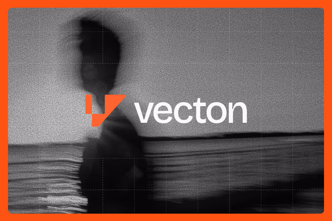
Vecton
Brand identity and website design for Vecton, an AI solutions and strategic automation company

Sevenloop
Brand identity and website design for Sevenloop, an end-to-end custom manufacturing solutions provider

Lumora Security
Branding and website design for Lumora Security, a cybersecurity solutions provider for growing businesses


FAQs
B2B Web Design
Experts

Swathi Mohan
Content Strategist

Mejo Kuriachan
CEO | Partner | Brand Strategist

Sanjana
Lead Designer

Tanmaya Rao
Lead Brand Designer | Illustrator