


Logo Design Agency
A logo is the most visible expression of your brand — it appears on every touchpoint from your website to your business cards to your product interface. Getting it right requires strategic thinking about your market positioning, audience expectations, and long-term brand evolution.
Logo Design Agency Bangalore Projects

Lumora Security
Branding and website design for Lumora Security, a cybersecurity solutions provider for growing businesses
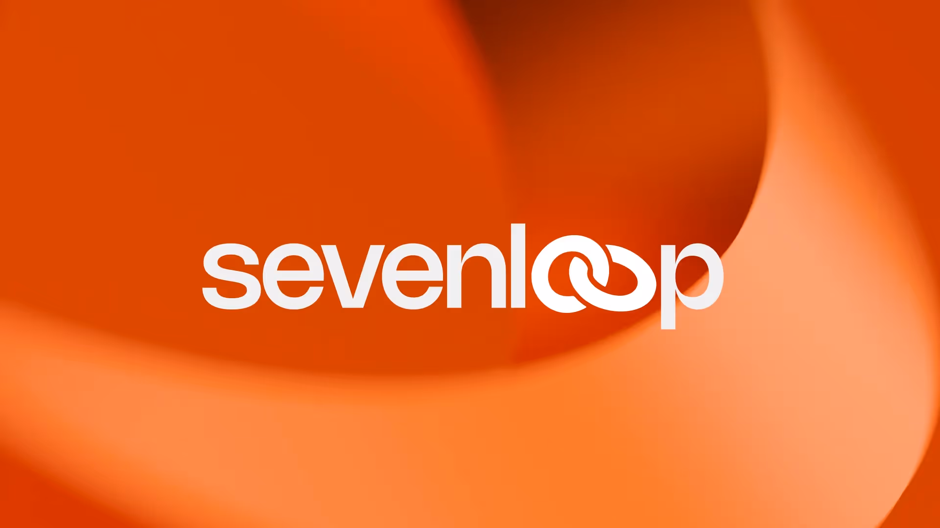
Sevenloop
Brand identity and website design for Sevenloop, an end-to-end custom manufacturing solutions provider
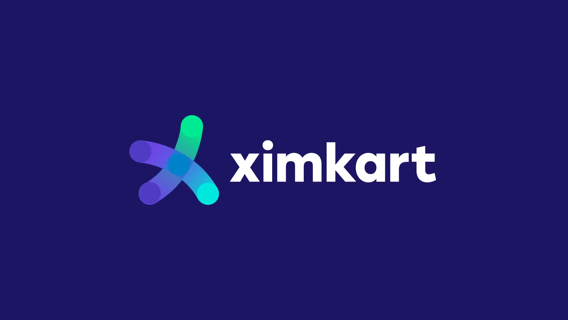
Ximkart
Brand and website design for Ximkart, a cross-border trade platform simplifying raw material imports
What makes a B2B logo design effective?
An effective B2B logo communicates credibility, simplicity, and differentiation in a single mark. It needs to work at every scale — from a favicon to a conference banner — and across digital and print applications. The best B2B logos avoid trends in favor of timeless design systems that age well and adapt to brand extensions as the company grows.


How to Design Logos for Brands That Drive Profit
Every startup founder knows that rebrands can feel like black holes for cash. But when built on a solid foundation, a powerful brand is rocket fuel for growth. Here are four guiding principles to ensure your next brand refresh not only looks great but also moves the needle on revenue.
1. Own Your Category Before Building Your Brand
Customers think in terms of categories first—“ketchup,” then “Heinz.” To dethrone a category leader, you must reshape how people understand the category itself. In fast-moving sectors like tech, defining and leading a new category is the ultimate moat. Invest in category strategy before diving into visual identity; it gives designers a north star and ensures every creative decision serves market domination.
2. Prioritize Emotion Over Logic
Brands that win don’t just list features; they make people feel something. If your own team doesn’t feel the excitement of the brand’s potential, neither will your customers. Seek authentic emotional connections—true passion, not hollow buzzwords. Emotional resonance breaks through the noise and transforms customers into evangelists.
3. Play in Culture, Not Just Marketing
Average brands stay within the boundaries of “marketing.” Top-tier brands infiltrate broader culture—they’re interesting on their own terms, not merely as ads. Cultural relevance lowers customers’ defenses and elevates brand status. Though it demands more creativity, the payoff comes in heightened brand love and higher margins.
4. Inspire Action—Get Customers Off Their Butts
The most iconic brands spark a movement. They challenge customers to rethink habits and empower them to act: “Just Do It,” “Think Different,” “What Will You Create?” Brands that ignite energy and agency earn premium pricing because they become catalysts for their customers’ aspirations.
By anchoring your brand in category leadership, emotional impact, cultural relevance, and a call to action, you’ll create identities that aren’t just pretty—they make money.
Why Bangalore Businesses Choose Everything Design for Logo Design?
In a city teeming with creative agencies, Everything Design has earned its reputation through a combination of strategic depth and executional care. Established by Mejo Kuriachan and Ekta Manchanda in 2020, our studio has grown into a multidisciplinary team that thrives at the intersection of brand strategy, visual identity, and digital innovation. While many agencies offer logo creation as part of a broader services catalog, Everything Design approaches each logo brief as a bespoke challenge—one that begins and ends with your unique business objectives.
Our positioning stems from three guiding pillars: strategic clarity, creative audacity, and executional excellence. We immerse ourselves in your market context, competitor landscape, and internal aspirations to unearth the visual cues that will set you apart. Bangalore’s leading B2B brands—from pioneering SaaS platforms to cutting-edge fintech startups—turn to us because we don’t just design logos; we engineer brand foundations that drive measurable growth. Our client testimonials continually highlight how a refocused logo identity has led to stronger partner conversations, accelerated sales cycles, and elevated brand recall in highly technical sectors.
A Signature Process for Memorable Logo Designs
Every successful logo emerges from a structured yet flexible process that balances research, exploration, and refinement. At Everything Design, our method unfolds in three interconnected phases:
At the outset, we conduct a deep dive into your brand essence and market dynamics. By combining stakeholder interviews, user empathy exercises, and competitive audits, we crystallize the positioning that will inform every design decision. This phase ensures that the resulting logo is grounded in strategic intent rather than stylistic trends.
Moving from research to creation, our design exploration generates a spectrum of visual concepts that explore typography, color psychology, and form language. Leveraging insights from our own blog series on brand design fundamentals, we iterate rapidly—presenting sketches, moodboards, and digital prototypes that invite constructive feedback.
In the final refinement stage, we polish the chosen concept and develop comprehensive usage guidelines. This includes scalable vector artwork, color palettes, and clear rules for application across digital and physical channels. The outcome is a logo system that not only looks exceptional on pitch decks and websites but also maintains consistency as your brand expands into new regions or product lines.
Case Studies: Logos That Speak Volumes
A logo’s true impact is reflected in how it empowers brands to tell their story. In our work with Ximkart, a cross-border trade platform, we distilled the ideas of global connectivity and trade efficiency into a logomark that seamlessly integrates arrow motifs with an abstract globe, reinforcing the platform’s promise of seamless import services. Meanwhile, our collaboration with TLH Law Firm involved crafting a refined wordmark that balances traditional serif letterforms with modern detailing, signaling both legal gravitas and forward-looking vision.
In every case, we track how a revitalized logo identity influences key performance indicators: increased web traffic quality, higher demo-to-close ratios, and more inbound partnership inquiries. By guiding clients through real-time analytics and user research, we demonstrate how foundational design decisions ripple outward, enhancing brand perception and commercial outcomes.
Emerging Trends in Logo Design for Bangalore’s Tech Hubs
As Bangalore continues to lead India’s technology transformation, several key logo design trends have taken hold. Responsive logos—those that adapt in complexity based on context—are rapidly gaining favor, allowing brands to maintain recognition across everything from mobile icons to large-scale signage. Monoline mark-making, where a single consistent stroke weight defines the symbol, offers both simplicity and a sense of handcrafted authenticity, particularly resonant for high-trust sectors like cybersecurity.
Another growing trend involves variable or dynamic logo systems, which subtly shift color, form, or animation based on user interactions. This approach injects a layer of interactivity that aligns with the digital-first mindset of Bangalore’s SaaS and fintech audiences. Everything Design’s own exploration of motion graphics and logo animation positions us to guide clients through these avant-garde possibilities, ensuring each brand remains both timeless and adaptable.
Partner with Everything Design for Your Next Logo Project
Choosing the right logo design partner means selecting an agency that understands your vision, audience, and growth trajectory. Whether you are launching a new venture, refreshing an established identity, or expanding into new markets, Everything Design offers the strategic acumen and creative ambition you need. By integrating rigorous research, bold ideation, and meticulous execution, we create logos that do more than look beautiful—they become memorable cornerstones of your brand story.
Ready to translate your brand aspirations into a distinctive logo? Connect with us through our Bangalore studio or schedule an exploratory call to discover how Everything Design can elevate your visual identity. Let’s craft the emblem that will carry your brand into its next chapter.
The Logo is Just the Beginning: Why Your Mark Needs Strategy, Motion, and Culture
A logo is not a finished product. It's a starting gun.
Most companies treat logo design as a box to check—they hire a designer, get a mark, and move on. But the most distinctive brands in the world use their logo as the seed of something much larger: a system, a philosophy, a rallying cry.
Two of the world's most forward-thinking design agencies—Motto and DixonBaxi—approach logo design from different angles, but they share one core belief: the logo's power isn't in how it looks, but in what it unlocks.
The Two Approaches to Logo Design
Motto: The Logo as Culture Codifier
Motto frames the logo as the visual embodiment of an Idea Worth Rallying Around—a big idea powerful enough to unite your team, attract your customers, and guide your company's growth.
For Motto, brand and culture are the two true competitive advantages of any business. The logo doesn't exist in isolation. It's woven into a larger system where every design decision—typography, color, motion, behavior—is rooted in leadership alignment and cultural clarity.
When Motto designed their own rebrand, they didn't start with aesthetics. They started with strategy. They asked: What are we really fighting for? The answer: Do Big Things™. That single idea became their north star, and the flag symbol they landed on—a mark representing "planting your beliefs"—was designed to codify that principle visually.
Key insight from Motto's philosophy:
"Culture is the brand. The brand is the culture. They influence each other in powerful ways."
This means your logo isn't just a marketing tool. It's an internal signal. It's how your team knows what you stand for. It's how you attract people who believe in your mission. Motto calls this embedding brand behaviors into a company's DNA—turning the logo into a living artifact of your values.
Motto's Approach in Practice
Starting with leadership alignment means defining what your company is fighting for before you ever open a design tool. It's not about visual preferences; it's about cultural clarity. Once that's locked, you codify cultural principles into what Motto calls a "Culture Code"—a set of behaviors and beliefs that translate your big idea into how people actually work.
The logo becomes shorthand for this vision. It's how you attract employees who believe in your mission, how you signal to investors what you're about, how you create an identity that customers remember. The mark works because it's rooted in something true about your company, not something designed for beauty alone.
Every touchpoint—from presentations to product to recruiting—reflects the same big idea. The logo anchors everything. When executed well, a logo designed this way becomes impossible to separate from your culture. It's not a brand asset you could swap out. It's a symbol your team has rallied around.
DixonBaxi: The Logo as System Engine
DixonBaxi takes a different path. They believe in one singular design principle hidden in the logo—a tilt, a curve, a fusion, a device—and then they scale that principle across every medium and application.
For DixonBaxi, the logo is the engine of a design system. It's not about where it lives; it's about what it does. A great logo generates behavior—motion, layout, pattern, digital experience, environmental design.
When DixonBaxi redesigned Roblox, they didn't create a new logo from scratch. They found the Tilt—a 15-degree angle that had been quietly embedded in the logo for years—and elevated it into the governing principle of the entire brand system. That tilt now powers everything: motion graphics, layouts, typography, spatial design, product UI. Across millions of user experiences, one principle creates coherence without ever feeling repetitive.
For Max (the streaming platform), DixonBaxi fused HBO's iconic bullseye with Warner Bros.' curved shield. But that fusion didn't stop at the logo. The curves were echoed in a bespoke typeface (Max Sans), used in graphic devices like "The Spotlight," embedded in motion design, and reflected in the color system. A single visual principle became the DNA of the entire brand ecosystem.
Key insight from DixonBaxi's philosophy:
"One Brand. All Worlds. We created a design system that expands expression across every experience, unifying the brand while unlocking new creative potential."
DixonBaxi's Approach in Practice
The process starts with finding the hidden principle—that one singular move that can govern an entire system. It might be a geometric relationship, an angle, a curve fusion, a shadow, or a spatial rule. Once identified, you translate that strategy into scale, creating design principles that work from tiny mobile icons to massive billboards to immersive experiences.
The logo shouldn't be static. It should animate, morph, and behave in ways that tell your story. DixonBaxi builds motion into meaning, so the logo isn't just recognized—it's felt. Other designers can follow the principles the logo generates, ensuring consistency at global scale without feeling rigid or constrained. The system breathes.
Where Motto and DixonBaxi Actually Agree
Despite their different starting points, both agencies understand something critical: logos are not ornaments. They are systems.
Motto starts with culture and asks: What are we really about? Then they design a mark that codifies that idea. The logo becomes an internal and external signal of your values.
DixonBaxi starts with strategy and asks: What is the one design principle that can scale everywhere? Then they design a logo that generates behavior across every touchpoint. The mark becomes the engine of a system.
The difference is one of entry point. Motto enters through leadership and culture. DixonBaxi enters through design principle and system behavior. But both paths lead to the same destination: a logo that does something, that means something, that scales into something much larger than a mark.
Motto would say: Culture is your competitive advantage. Make sure your logo signals it.
DixonBaxi would say: Strategy is your foundation. Make sure your logo generates it.
Both are right. And the strongest brands in the world are those that nail both: logos rooted in authentic culture and logos that generate powerful, coherent systems at scale.
What This Means for Your Brand
If you're about to commission a logo, ask yourself these questions in order:
First, the Motto question: Do I have a big idea that my team can rally around? Can I articulate in one sentence what we're fighting for? Is my leadership aligned on this?
If you can't answer these clearly, you're not ready for logo design yet. You're ready for strategy work—internal alignment, mission clarity, cultural definition.
Second, the DixonBaxi question: Once I have that clarity, what is the one design principle that can scale across every medium? What visual move—a tilt, a curve, a proportion—can govern how this brand behaves from a favicon to a billboard to a product interface?
A great logo design engagement should do three things simultaneously:
Clarify your competitive advantage. The logo should make it obvious what makes you distinctly different. Not through clever symbolism, but through clarity about what you stand for and how you operate.
Define a visual system. The logo should generate behavior. It should spark questions like: How does this angle show up in typography? How does this principle guide layout? What motion does it suggest? If you can't answer these questions, the logo hasn't given you a system—it's just a mark.
Build culture inside. Does your team feel pride in what the logo represents? Do new hires immediately understand what the company stands for by looking at it? Does it make sense internally before it makes sense externally?
The Risk of Skipping Strategy
Many brands commission logos without doing strategy work first. They end up with beautiful marks that don't do much. They look polished but don't drive behavior. They're approved by executives but don't inspire employees. They're used on websites but don't generate systems. They're ornamental.
Motto would tell you: You don't have a brand problem. You have a culture problem. Fix the root first.
DixonBaxi would tell you: You don't have a logo problem. You have a system problem. Your mark needs to generate something.
Both are saying the same thing: the logo is the symptom, not the disease. You can't design your way out of strategic confusion. You have to think your way through it first.
The Logo as Starting Gun
The best logos in the world—Apple's, Nike's, Roblox's, HBO's, Max's—aren't memorable because of their shape. They're memorable because they anchor something bigger.
They represent a culture. They generate a system. They spark motion. They rally people around a cause.
When you design a logo, you're not designing a mark. You're planting a flag. You're codifying a principle. You're launching a system that will shape how customers experience you, how employees understand you, and how partners remember you.
That's why logo design, when done right, isn't quick. It's not cheap. And it's absolutely worth the investment.
Start with strategy. Start with culture. Start with clarity. Then design. Then scale. That's when a logo becomes powerful.