Venture Capital Website Development Agency
A VC website is the firm's first conversation with a founder. Most VC websites read like a corporate finance brochure and lose the founder before the deck even comes out.

What should a venture capital firm's website do for founders?
We design and develop VC firm websites built to win deal flow — clear thesis, credible portfolio storytelling, partner-led positioning, and a founder-friendly UX. Webflow build, strategy first. Clients include Stellaris and other early- and growth-stage firms.
What Should a VC Firm's Website Communicate?
A venture capital website must instantly establish credibility while clearly articulating thesis, portfolio strength, and founder value proposition. Everything Design builds VC websites that balance institutional authority with approachability — helping firms attract the right founders and co-investors.
Trusted by venture-backed teams. Everything Design has partnered with founders and portfolio companies backed by leading venture funds — including Stellaris, General Catalyst, Z47, Antler, Energy Impact Partners, 3one4 Capital, B Capital, Social Alpha, growX Ventures and 8X Ventures.
FAQs
Venture capital firms operate in information-intensive environments where design translates complex investment data, market opportunities, and company performance into persuasive formats for LPs, startups, and portfolio companies. Essential design services support pitch decks, financial reporting, brand development, and digital platforms that facilitate deal flow and relationship management.
Pitch Deck and Presentation Design
VC firms require professionally designed pitch decks and investor presentations that communicate fund strategy, historical returns, investment thesis, and portfolio company success stories. Design must make financial data compelling and memorable—complex figures become immediately clear through thoughtful visualization. Each deck reinforces fund positioning and demonstrates investment discipline. Consistent design language across multiple presentations strengthens fund brand identity with LPs and potential limited partners evaluating investment opportunities. Presentation design extends to town halls, quarterly updates, and annual reports communicating performance to stakeholders.
Website and Digital Strategy
VC firm websites serve dual purposes: attracting founder interest and demonstrating investment credibility to LPs. Design must clearly articulate fund focus areas, check sizes, and founder support capabilities. Portfolio company showcases with performance metrics and exit outcomes provide proof of value-add beyond capital. Digital platforms may include founder resource centers, deal flow management systems, and founder community portals. These require thoughtful UX design accommodating diverse technical backgrounds and ensuring accessibility to valuable resources.
Portfolio Company Brand Support
Growing funds provide branding and design support to portfolio companies, strengthening ecosystem services and adding portfolio company value. This may include identity refreshes, website redesigns, pitch deck design, or marketing material development. Offering design resources differentiates funds in competitive LP markets and accelerates portfolio company growth, ultimately improving fund returns.
Data Visualization and Analytics
VC decision-making depends on complex market data, fund performance metrics, and comparative analysis. Design services translating spreadsheets into compelling visualizations support better decisions and more effective communication with stakeholders. Dashboard design, infographics, and interactive data tools help manage portfolio intelligence. Explore our strategic design services for financial and professional services companies. Learn about our positioning and branding expertise, review case studies in VC-focused design, and connect with our team.
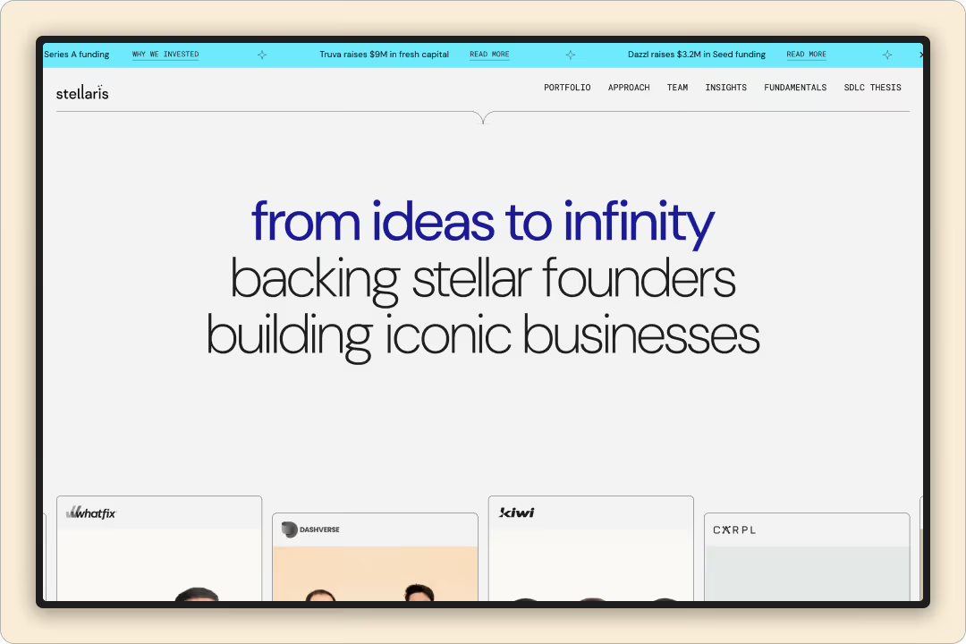
A venture capital (VC) firm’s website needs to communicate credibility, focus, and approachability to both startups (potential investments) and limited partners/investors. In the case of Stellaris (a VC firm), some key elements likely include:
1. Team and Philosophy Front and Center: VC is a people business, so Stellaris’s site probably highlights the partners with professional photos and bios, along with the firm’s investment philosophy or mission (e.g., “We back bold entrepreneurs in enterprise tech”). This builds trust – founders want to know who they’d be working with.
2. Portfolio Showcase: An effective VC site prominently features logos or stories of companies they’ve invested in. Stellaris might have a grid of startup logos they funded, possibly filterable by industry or stage. Clicking in might show short case studies or news of those companies’ successes (exits, next funding rounds, etc.), which signals Stellaris’s track record.
3. Focus Areas: A section that outlines what sectors or types of businesses Stellaris invests in (for example, “Healthcare AI, FinTech, SaaS”) so entrepreneurs can self-qualify. This might be done through icons or brief copy and ensures the firm’s focus is clear.
4. Content and Resources: Many modern VC sites include blogs or insights (e.g., articles by partners on market trends, or guides for startups) – this positions Stellaris as a thought leader and helpful partner beyond just money.
5. Call-to-Action to Pitch: It’s common now to have a “Submit Your Pitch” or contact form for entrepreneurs. Stellaris’s design would make that accessible (maybe a “Looking for funding? Start here” button), while maintaining a professional tone. Visually, the site would use a clean, confident design – likely minimalistic with sophisticated typography and perhaps imagery of innovation (like people working on tech, or abstract illustrations) to feel dynamic yet trustworthy. In summary, Stellaris’s web design effectively balances showcasing credibility (team, portfolio, successes) with inviting new opportunities (clear focus, easy contact), all wrapped in a modern design that reflects the forward-looking nature of venture capital.
Understanding VC Firm Website Requirements
Venture capital firm websites serve fundamentally different purposes than traditional corporate sites. VCs don't sell products to consumers—they invest in founders and companies. The website becomes a credibility signal to entrepreneurs evaluating whether to pursue investment. It must communicate the firm's investment thesis, portfolio quality, team expertise, and founder-centric approach. Founders research VC firms extensively before outreach; a poorly designed or outdated website signals that the firm isn't serious or sophisticated. Conversely, a thoughtfully designed site conveys that the firm invests in quality at every level. This is why VC website design requires deep understanding of founder psychology and the investment decision process.
Portfolio-First Design and Founder-Centric Storytelling
The most effective VC websites prioritize portfolio companies with stunning visual presentations, case studies, and founder testimonials. Rather than generic "about us" content, VC website design should showcase 8-12 portfolio highlights with compelling narratives about each company's journey, the founder vision the firm backed, and measurable outcomes. High-quality photography of portfolio founders humanizes the investment approach and demonstrates the firm's access to category leaders. Founder testimonials discussing partnership quality matter more than any marketing copy. The design should feel founder-centric throughout: minimalist layouts emphasizing clarity over flashiness, fast-loading performance respecting founder time, and intuitive navigation allowing quick understanding of the firm's thesis and track record. This approach transforms the website from a vanity project into a recruiting and positioning tool.
Team Credibility and Investment Philosophy Communication
Investors evaluate VCs based on partner track records, sector expertise, and operational value-add beyond capital. Effective VC websites feature detailed team bios highlighting past successes, board memberships, and specific value they bring to portfolio companies. Investment thesis documentation—whether via blog posts, whitepapers, or manifesto statements—builds credibility. Entrepreneurs want to understand what the firm believes about the future and why they're positioned to support winners. Transparent communication of thesis helps self-select investors and founders who align with the firm's values. Design should support this credibility-building through professional quality, fast performance, and sophisticated interactions that signal operational excellence.
Founder Experience and Conversion Optimization
Every element of a VC website design should serve founder experience. Founders are busy building companies; they don't have time for slow-loading sites or confusing navigation. Information architecture should allow founders to quickly understand fund size, stage focus, geography, thesis, and how to apply. Clear calls-to-action ("Pitch Us," "Learn About Our Approach") should be prominent and easy to follow. Many VC sites fail because they optimize for vanity (impressing other VCs) rather than founder conversion (helping founders understand if they should pitch). Discuss how we design VC websites that balance partner credibility signaling with founder-focused usability. Explore our work with capital firms and case studies of VC website redesigns driving founder engagement and deal flow.
The strongest VC and fund website revamps share one trait: they make the firm read as institutional and permanent to a limited partner (LP), not like an early-stage startup. Everything Design has done exactly this for several India and global venture brands — Stellaris Venture Partners, Indian VCs, Z47 (formerly Matrix Partners India), BEENEXT, Trifecta Capital, and Social Alpha. Here are the case studies worth studying, and what made each one land with LPs.
Stellaris Venture Partners — built for longevity, so it signals permanence
Stellaris set out to build something long-lasting rather than a site they would redesign every year. We designed it for longevity — no annual redesign cycle — and the investment team, the people closest to founders and LPs, felt proud of the result. Stellaris chose us after hearing “the same recommendation four to five times.” For an LP, a fund website that still looks current years later is a quiet signal of institutional stability. See the Stellaris Venture Partners case study.
Indian VCs — from a WhatsApp list to the operating infrastructure of Indian venture
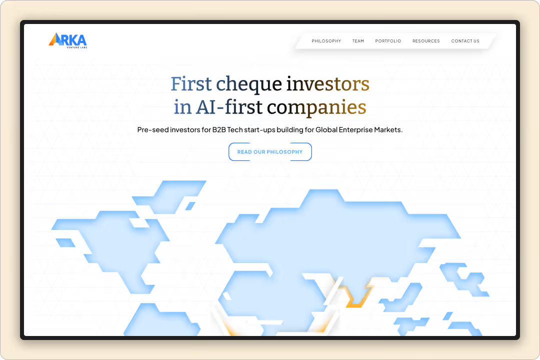
Indian VCs outgrew a casual, community-first brand and needed one serious enough for global forums and LP audiences. The revamp condensed a sprawling directory into a clean, fast platform positioned as the operating infrastructure for India's venture ecosystem — and the numbers moved: average session time rose from roughly 1.5 minutes to 2–2.5, with heat-maps showing visitors reaching the decision-driving data points faster. It is global storytelling built to represent a fund brand at scale. See the Indian VCs engagement.
Z47 (formerly Matrix Partners India) — thought leadership as an LP magnet
For Z47, we designed and built a dedicated landing page for The India AI Report — original research aimed at founders, LPs, and the broader ecosystem — treating the report itself as the protagonist rather than a download CTA. Research-led pages are one of the most effective ways a fund earns and holds LP attention. See Z47.
BEENEXT, Trifecta Capital, and Social Alpha — clarity and authority across the stack
We have delivered websites for BEENEXT (early-stage VC), Trifecta Capital (venture debt), and Social Alpha (impact and deep-tech backer) — each built to make a differentiated investment thesis legible to the specific capital and founders it serves.
What makes a VC website revamp appeal to LPs
Across all of these, the LP-facing pattern is consistent: signal permanence and institutional seriousness; make the thesis and differentiation legible in seconds; foreground track record, portfolio, and original research over generic “we back founders” copy; and ship a fast, clean, credible experience. That is the difference between a site that reads like a startup and one an LP trusts with a commitment.
Common patterns that resonate with institutional investors
The strongest VC and fund websites share the same signals — the ones LPs read as seriousness:
- Investment philosophy is explained before portfolio logos.
- Team expertise and decision-making process receive prominent placement.
- Market insights and research demonstrate intellectual rigor.
- Design is understated and timeless rather than trendy.
- Performance is signaled through exits, portfolio maturity, and reputation instead of flashy claims.
- Navigation reflects distinct audiences — LPs, founders, portfolio companies, and media.
The common evolution in a successful VC redesign
Across the strongest examples, the progression looks like this.
Before:
- Founder-centric messaging
- Logo walls
- “We invest in the future”
- Animated landing pages
- Generic venture imagery
After:
- Clear investment thesis
- Structured investment strategy
- Team depth and operating experience
- Portfolio outcomes and case studies
- Thought leadership
- Institutional visual language
- Governance, platform capabilities, and credibility signals
That shift mirrors what LPs evaluate during diligence: repeatable process, differentiated strategy, an experienced team, and evidence of execution.
Everything Design is a B2B branding and website agency in Bengaluru, founded in 2019, working across India's venture landscape. Explore our venture capital design practice, our VC website design and development work, or book a call.
Venture Capital Website Development Agency Projects
Venture Capital Website Development
Experts

Ekta Manchanda
Co-Founder | Principal Designer

Athira Krishnan
Lead Designer | Content Strategist

Saurabh Chakradhari
Head of Webflow Department