


Website Design Agency for US Market
Everything Design works with US-based companies to build websites that resonate with American enterprise buyers. We combine global design talent with deep understanding of US market expectations — clean interfaces, fast load times, and conversion-focused architectures.
Website Design Projects for US Audience
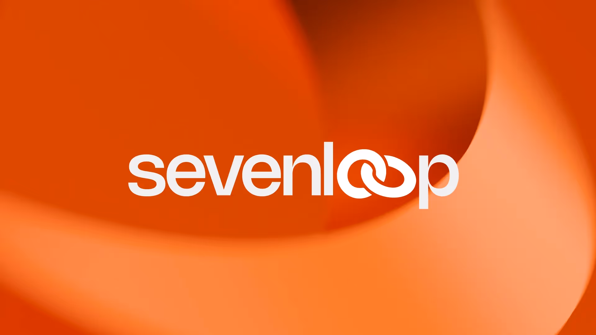
Sevenloop
Brand identity and website design for Sevenloop, an end-to-end custom manufacturing solutions provider

Ayr Energy
Brand identity and website design for Ayr Energy, a critical power grid equipment manufacturer
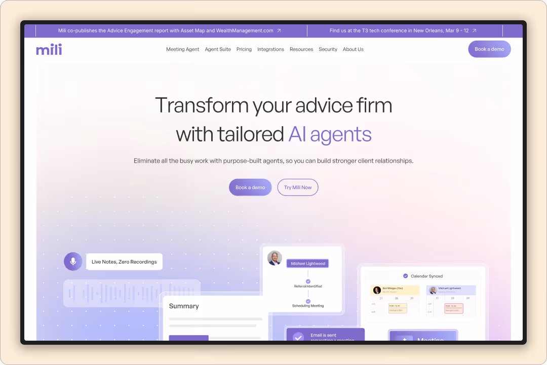
Mili
Brand and website design for Mili, an AI meeting assistant for wealth advisors and financial professionals
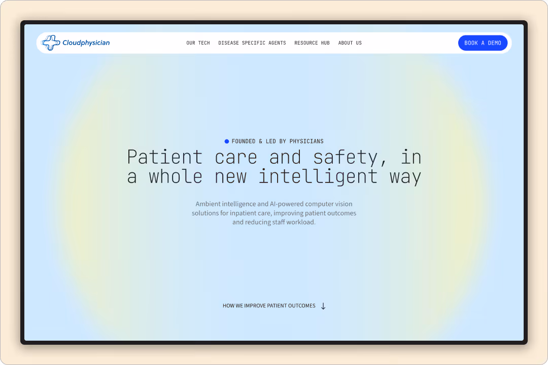
Cloudphysician
Visual branding and website design for Cloudphysician, an AI-powered platform that enhances critical care monitoring
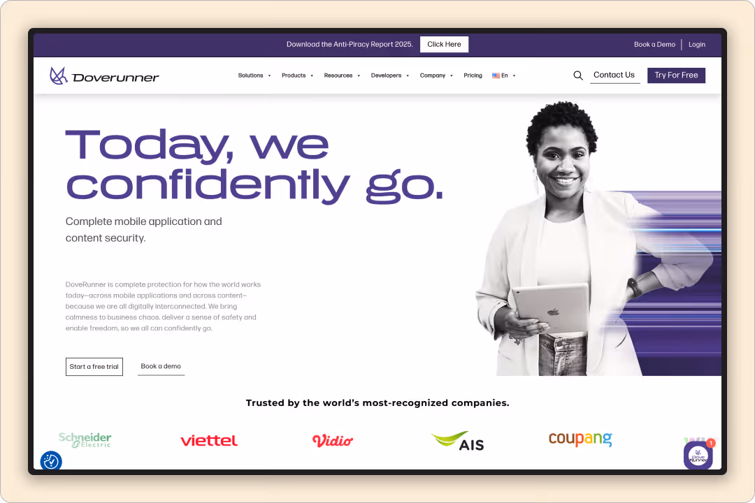
Doverunner
Brand identity and website design for Doverunner, a mobile app and content security platform
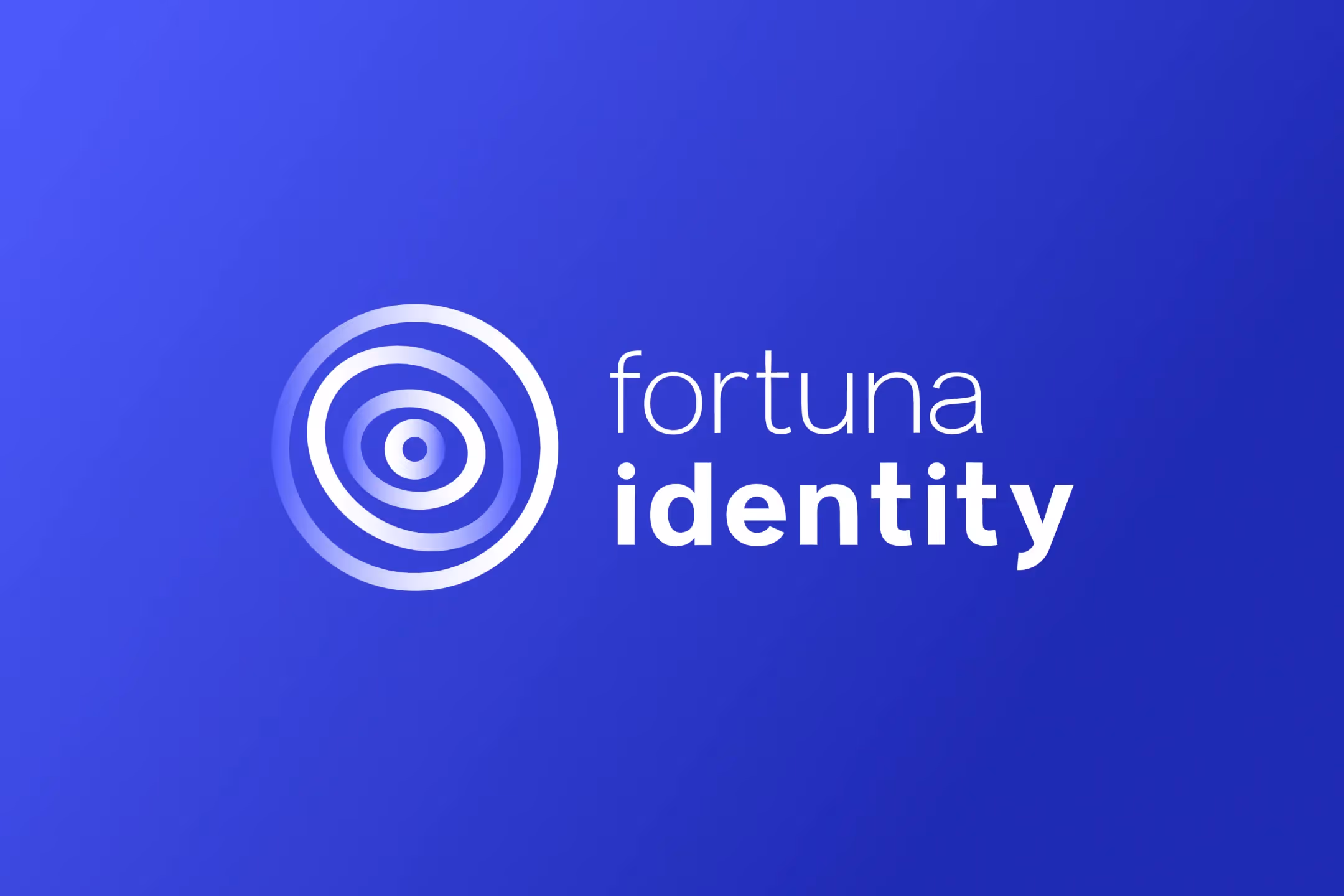
Fortuna Identity
Brand strategy and identity design for Fortuna Identity, a cybersecurity firm specializing in identity and access management
.avif)
Fortuna Cysec
Brand strategy and website design for Fortuna Cysec, an AI-driven managed security services provider for threat detection and compliance
Why do US companies work with Everything Design for their websites?
US companies choose us because we deliver Silicon Valley-caliber design at a pace and price point that in-market agencies struggle to match. Our team understands American buyer psychology, compliance requirements, and the competitive landscape across SaaS, fintech, healthcare, and enterprise tech verticals. Every project ships on Webflow with full CMS control.


Website Design Projects for US Market
Everything Design is a top B2B branding and website agency that specializes in creating high-impact web experiences for US-focused brands. Their portfolio demonstrates expertise across tech startups, SaaS, finance, manufacturing, and cybersecurity, with a proven record of market expansion and repeat client engagement.
Key projects include FinTech brand storytelling for Botim, a strategic website refresh for Stellaris Venture Partners (VC), and digital marketing materials for Progcap. US expansion work for Ximkart and cybersecurity positioning for Fortuna Identity showcase their sector versatility. Their clarity-first approach ensures messaging stands out for American audiences—turning complex business stories into websites that drive confidence, investor interest, and differentiation.
Our Web Design Process for US Brands
Results & Impact for Your Business
Everything Design's process blends strategy, compelling visuals, and technical precision—delivering value for US startups, enterprises, and growth-stage brands seeking world-class web design and branding.
Several top website design agencies in India specialize in serving the US market, offering global standards in UI/UX, conversion-focused web development, and end-to-end digital solutions. One of these is Everything Design, recognized for handling SaaS, tech, B2B, and startup clients that require both design innovation and measurable business impact.
Most of the "great product, terrible first impression" stories we see are not product problems at all – they're clarity problems. As a website agency, our first job is to strip away the cleverness and make sure a US visitor can answer two questions in five seconds: What does this do? and Is it for me? We start by rewriting the hero so it behaves like a decision shortcut, not a riddle. That means naming the role your product plays ("coach", "copilot", "dashboard", "command centre"), spelling out what it does in plain language, and tying it to a simple outcome your buyer actually cares about. No buzzwords, no vague promises – just a direct, confident line that your ideal customer can repeat back to someone else.
Once the core message is clear, we move to proof. For US audiences, a bold claim without demonstration is just noise, so we build Before → After narratives into the page: a weak input, how your product interacts with it, and the stronger output it creates. This could be a bad LinkedIn post next to an improved version, a messy workflow mapped against the streamlined one, or a cluttered report beside your clean, actionable dashboard. Around that, we layer honest, specific metrics – engagement lifts, time saved, error reduction, revenue impact – so visitors can see not just what your product changes, but by how much. The result is a page that feels less like marketing and more like a transparent walkthrough of how your product actually delivers.
Underneath all of this is a simple principle that guides our work: speak the language of how US customers decide, not how founders describe. Every page we design is built to be simple (no decoding required), direct (clear role, clear function, clear outcome), and proved (real examples, real numbers, real screens). We apply that lens to your messaging, structure, visuals, and CTAs so your website stops behaving like a pretty brochure and starts acting like a sales asset – one that makes the right people stay, understand you quickly, and feel confident enough to take the next step.