


How to write website hero copy?
Effective website hero copy conveys your value proposition in one clear line—leading with the customer’s problem, stating your unique solution, and using specific, jargon-free language that drives action.
Write compelling website hero copy by leading with the specific outcome your ICP cares about, not your product features. Use your buyer's language, address their primary pain point, and include a clear value proposition in under fifteen words. Effective hero copy passes the five-second test: visitors instantly understand who you serve, what you solve, and why you're different.
The Fastest Way to Improve Your Website: Fix Your Hero Copy
In 90% of B2B SaaS websites, the hero section is cluttered with confusing text. It often fails to clearly communicate what the product is or who it’s for. This is a critical problem because when prospective customers land on your site, they immediately want answers to two fundamental questions:
- What is this product?
- Is this product meant for me?
If your hero copy doesn’t answer these questions instantly, you're missing a prime opportunity to capture attention.
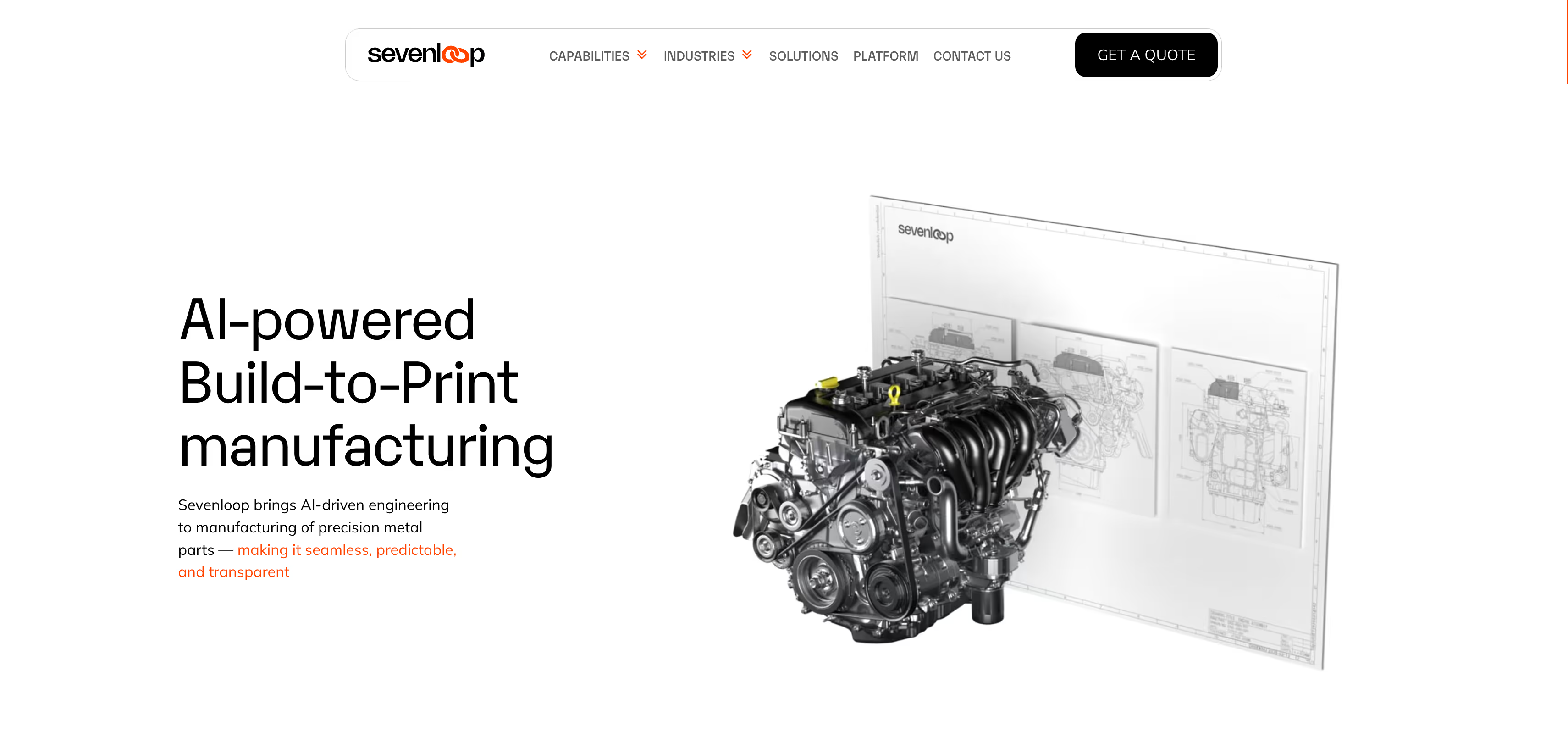
Website Hero Copy Example from Everything Design Agency
If you see here the hero message says "AI-powered Build-to-Print manufacturing" it clearly says the what Sevenloop does, also with the supporting animation we are making sure buyers get the information. The body copy is also helping to nail the message here. Manufacturing of precision metal parts tells the buyer it is for metal parts. The nav bar is also important here - it tells that you can check the capabilities, industries, solutions. The drop down indication tells that there are multiple capabilities and industries. The button informs the buyer that there is an option to get a quote if required.
Your website hero section should distill the essence of your brand. It’s the first impression, the welcome mat, and the invitation for the visitor to dive deeper into what you have to offer.
The visitors land on your website with a choice to make- whether to scroll further or bounce off. The choice is made based on how well your hero copy resonates with their needs.
Why does hero copy matter?
Visitors form opinions about websites in as little as 50 milliseconds. The hero section sets the expectations and feeds perception using language, tone and hierarchy. It builds credibility by offering a good user experience, which starts with a clear, concise messaging.
Hero sections are not only about grabbing attention, they’re about establishing relevance, showcasing value, and gently nudging visitors to engage further. When done well, the hero section does the following-
Instant Clarity: By answering “What does this product do?” visitors gain an immediate understanding of your offer.
Brand Positioning: It introduces your brand's personality and values subtly and effectively.
Guided Visitor Journey: It provides a clear next step, whether it’s scrolling down or clicking through.
Your hero copy sets the stage for user experience. It either sparks curiosity, prompting to scroll further or makes visitors bounce off to find something more relevant.
Common Mistakes in Hero Copy (And Why They Happen)
Use of jargons, puns/metaphors without context-
Many B2B websites try to be clever, in an attempt to stand out from the cloud. In doing so, they often fail to account for clarity. Simplicity is close to clarity, but simplicity is considered boring, not too creative. It doesn’t have to be so.
Clear, concise communication sticks with the visitors. It makes associations as it’s easier to comprehend and relate to. Visitors like it when they are able to gauge what they gain with minimum friction and no ambiguity.
Where's B2B Website Communication Going Wrong? | Swathi | Content Writer | Everything Design
Consider these headlines for example-
- Delight employees, deliver growth
- Your data & your vision, Empowered by our innovation
- Developer productivity solved
- Mounting up harmony in your workplace
- Digital drives efficiencies, we drive digital
Visitors squint their eyes, exclaiming “what are they talking about, man?” while involuntarily shaking their head. That’s because phrases like these sound sophisticated, grand and out of the world. Simply put, not relatable. In order to understand and relate to your business’s value proposition, it has to sound very much from this world.
Cognitive fluency plays a critical role, especially when visitors are still scouting for ‘the” perfect match for a solution. Ambiguous communication is perceived less credible and in b2b its about the value you provide over clever or poetic lines.
The ‘god-of-all’ statements-
I’m sure you’d agree to have read headlines that go like- “The only productivity tool your employees need”, “All-in-one-automation tool”, “Best-in-class people management software”, etc. Statements like these are nothing but hype. Hype copy builds on empty, vague foundations. They have no backing or proof. Lines like these in the headline are a major red flag. They drag the website’s effectives down to the ground because they sound too good to be true, making the visitor chuckle and not believe in you. You claim it if you can substantiate it either in the sub-headline with legitimate proofs or just keep away from using such statements.
What Makes an Effective Hero Copy?
Let’s back-track a little, and try to wear the visitor’s hat, shall we?
There’s a problem your target customer is trying to resolve. They ask around, scout the internet and gather the insights- The zero-th moment of truth. They make note that your product/service is one of the potential solutions.
What next?
They want more information. Credible information. So they turn to your website; your holy grail.
If your website’s hero section reaffirms their perception (that you are the solution) and feeds them with credible information on how, then your hero section has done a good job.
Here’s how to have a conversation with the website visitor-
The Headline copy (H1)-
This is the first thing the visitor would read. An effective headline is one that is clear, concise and crisp. Let’s call it the 3 C’s of effective headline.
The sub-text-
The sub-headline has to substantiate the headline. If you choose to go with an ambitious headline (H1) then the sub-headline is a great place to elaborate further and communicate things that actually matter, say your value proposition.
The Call to Action-
The call to action has to be clear and relevant. Phrases like “click for more”, “Explore”, are vague phrases to be avoided, for good. The CTA should correlate to what’s communicated in the headlines and act as a natural course of action, nudging the visitor onto the definitive next step.
Brand personality-
Consider your brand’s personality- the way you speak; the language you use, tone of voice, your grammar and lingo. All of these create a unique personality for your brand.
Hierarchy-
The placement of the pieces of writing also makes for an effective hero section. People don’t read things word by word. They skim through, picking on key words. A Nielson study of eye-tracking found that people read web content in F-shape.
Top-most space- Visitors begin by reading horizontally across the top of the page. Place your headline here. Keep it bold or blow it up in size, proportionally. This should technically be the first thing the visitor reads.
Second-to-the-top space: Visitors move down the page and read horizontally again, but over a shorter area. The sub-headline comes below the headline. Smaller in size and/or form to the headline text, drawing attention secondary only to the headline sentence.
The vertical trunk: Visitors scan downwards from the left side of the page vertically. Your CTA could essentially be here.
How to fix your website hero copy? (with examples)
1. Clarity Over Cleverness
To make a strong first impression is to “wow” the visitors with your value proposition. Not super-complicated words threaded to sound nothing like normal language. While it’s tempting to be clever or use industry jargon, clarity wins every time.
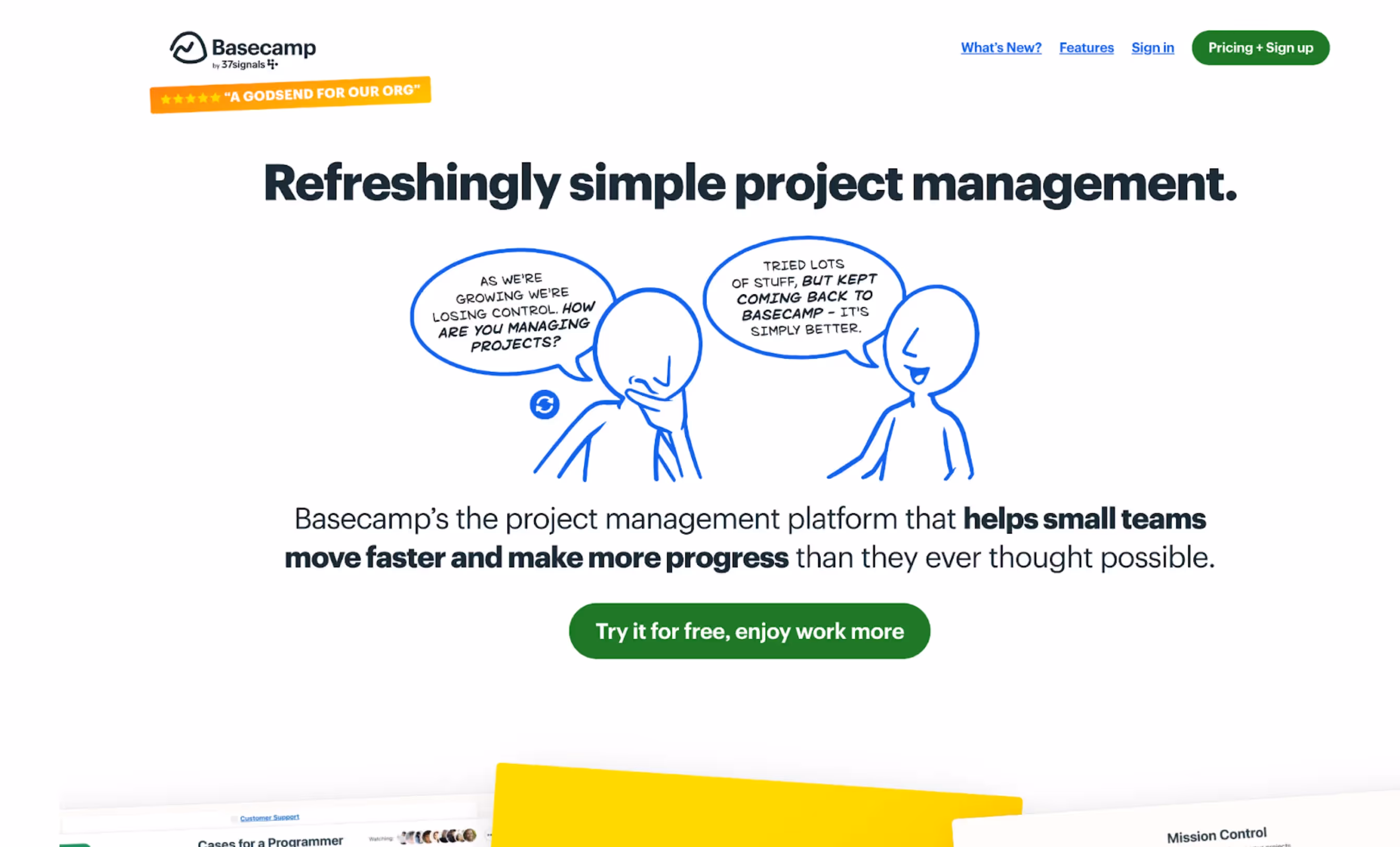
Take basecamp for example. The hero section does a fabulous job of clearly communicating “what” is basecamp and what it does and for “who”. The sub-text even ends with an aspirational set of words, extending possibilities.
When drafting your hero headline, ask if someone new to your website would understand what you’re offering without needing further explanation. If the answer is no, refine it until it’s unmistakable.
2. Speak to your ICP over the mass-
Clearly define who your target audience is by defining your ICP. Directly mentioning your target audience in the hero copy assures prospective clients that your solution is tailored to their specific needs. It is as important to make it crystal clear who your solutions are for as it is to make it clear who it is not for. By doing so,you can restrict and control it, minimising bounce and increasing relevance.
3. Build trust over tricks-
Avoid practising gimmicks. Ditch distracting typewriter effects, rotating banners, or carousels that obscure the key message. If you are a relatively newer brand, social proofs are great to build credibility and trust. Customer testimonials, awards and recognitions, client marquee logos, all of these are elements that build trust, reassuring the website visitors that your product is widely adopted, respected and is capable of achieving results.
Building trust also means ridding the visitor off of all their hesitance. Especially if your solution deals with data, security and/or health.
Your hero section should make the visitor feel like “this is the place to all my answers”. They should naturally progress to scroll below the fold and keep scrolling to eventually take action.
4. Emphasis customer benefits over features-
Features are product-oriented, and benefits are customer-oriented. Precisely why customers care to listen and connect with it better. While it’s important to explain what your product does, hero copy that highlights how it benefits the customer will have greater impact. Instead of focusing solely on features, draw attention to the problem your product solves or the pain point it addresses.
Checklist on crafting an effective hero section-
To summarize, here’s a checklist for creating an effective hero section:
- Headline: Does it state the product or service’s purpose clearly?
- Sub-Headline: Does it support the headline with a clear value proposition?
- CTA: Is it actionable, relevant, and directly related to your product?
- Trust Signals: Are there social proofs or trust elements that reassure visitors?
- Audience-Specific Language: Is the copy tailored to resonate with your ICP?
- Readability: Is the copy clear, concise, and free of jargon?
Applying Psychology to the hero section-
Priming to build perception-
Priming occurs when exposure to one stimulus influences a response to another stimulus later on. In hero copy, priming can help shape a visitor's mindset by building positive associations with your brand or product from the outset. By carefully choosing words that evoke growth, progress, and modernity, you can align your product with favorable perceptions before the visitor dives into more details.
Headlines like- “Security Solutions Built for the Digital Age” would prime the visitor to feel safe and up-to-date.
Loss Aversion-
Loss aversion is a psychological principle where people are more motivated to avoid losses than to make gains. In B2B marketing, emphasizing potential losses or risks can be particularly effective, as businesses tend to be risk-averse. By subtly alluding to what might happen if a company doesn’t act, your hero copy can create a sense of urgency without being overly aggressive.
Framing – Think about the positive and negative aspects of your message. For instance, instead of saying, “Improve Operational Efficiency,” you could frame it as “Reduce Costly Inefficiencies,” emphasizing what’s avoided as much as what’s gained.
Why does your hero copy matter more than you think?
Visitors form opinions about websites in as little as 50 milliseconds. The hero section sets expectations and feeds perception using language, tone, and hierarchy. It builds credibility by offering a good user experience, which starts with clear, concise messaging.
Hero sections are not only about grabbing attention—they're about establishing relevance, showcasing value, and gently nudging visitors to engage further. When done well, the hero section delivers instant clarity by answering "What does this product do?", introduces your brand's personality and values subtly and effectively through brand positioning, and provides a guided visitor journey with a clear next step. Your hero copy sets the stage for user experience. It either sparks curiosity, prompting visitors to scroll further, or makes them bounce off to find something more relevant.
Why do 90% of B2B SaaS websites fail the hero test?
When prospective customers land on your site, they immediately want answers to two fundamental questions: What is this product? And is this product meant for me? If your hero copy doesn't answer these questions instantly, you're missing a prime opportunity to capture attention. The choice to scroll further or bounce off is made based on how well your hero copy resonates with their needs.
What are the most common mistakes in hero copy?
Are you using jargon and clever metaphors without context?
Many B2B websites try to be clever in an attempt to stand out. In doing so, they often fail to account for clarity. Simplicity is close to clarity, but simplicity is considered boring, not too creative. However, it doesn't have to be this way. Clear, concise communication sticks with visitors. It makes associations because it's easier to comprehend and relate to. Visitors prefer to gauge what they gain with minimum friction and no ambiguity.
Consider these headlines: "Delight employees, deliver growth," "Your data & your vision, Empowered by our innovation," "Developer productivity solved," "Mounting up harmony in your workplace," or "Digital drives efficiencies, we drive digital." Visitors squint their eyes, exclaiming "what are they talking about?" while involuntarily shaking their head. These phrases sound sophisticated, grand, and out of the world. Simply put, not relatable. In order to understand and relate to your business's value proposition, it has to sound very much from this world.
Cognitive fluency plays a critical role, especially when visitors are still scouting for the perfect match for a solution. Ambiguous communication is perceived as less credible. In B2B, it's about the value you provide over clever or poetic lines.
Are you making "god-of-all" statements that lack substance?
Headlines like "The only productivity tool your employees need," "All-in-one-automation tool," or "Best-in-class people management software" are nothing but hype. Hype copy builds on empty, vague foundations. They have no backing or proof. Lines like these in the headline are a major red flag. They drag the website's effectiveness down to the ground because they sound too good to be true, making the visitor chuckle and not believe in you. If you claim it, you must substantiate it either in the sub-headline with legitimate proofs or simply keep away from using such statements.
How do visitors actually experience your website?
There's a problem your target customer is trying to resolve. They ask around, scout the internet, and gather insights—what's known as the zero-moment of truth. They make note that your product or service is one of the potential solutions. What next? They want more information. Credible information. So they turn to your website.
If your website's hero section reaffirms their perception that you are the solution and feeds them with credible information on how, then your hero section has done a good job. Here's how to have a conversation with the website visitor through your hero section.
What makes an effective hero copy?
What role does your headline play?
The headline is the first thing the visitor reads. An effective headline is one that is clear, concise, and crisp—the 3 C's of effective headline copy. This is where you make your primary impression count.
How should your sub-headline support your headline?
The sub-headline has to substantiate the headline. If you choose to go with an ambitious headline (H1), then the sub-headline is a great place to elaborate further and communicate things that actually matter, such as your value proposition. It provides the proof and context for your primary claim.
Why is your call-to-action critical?
The call to action has to be clear and relevant. Phrases like "click for more" or "Explore" are vague phrases to be avoided. The CTA should correlate to what's communicated in the headlines and act as a natural course of action, nudging the visitor onto the definitive next step.
How does brand personality influence your hero section?
Consider your brand's personality—the way you speak, the language you use, tone of voice, your grammar, and lingo. All of these create a unique personality for your brand. Your hero copy should reflect this personality consistently.
How should you structure your copy using visual hierarchy?
People don't read things word by word. They skim through, picking out key words. Research found that people read web content in an F-shape pattern. Structure your hero section accordingly:
Top-most space: Visitors begin by reading horizontally across the top of the page. Place your headline here. Keep it bold or blow it up in size, proportionally. This should technically be the first thing the visitor reads.
Second-to-the-top space: Visitors move down the page and read horizontally again, but over a shorter area. The sub-headline comes below the headline, smaller in size and form, drawing attention secondary only to the headline sentence.
The vertical trunk: Visitors scan downwards from the left side of the page vertically. Your CTA could essentially be here.
How do you fix your website hero copy in practice?
How can you prioritize clarity over cleverness?
To make a strong first impression is to "wow" the visitors with your value proposition—not with super-complicated words threaded to sound nothing like normal language. While it's tempting to be clever or use industry jargon, clarity wins every time.
Look at how Basecamp approaches this. The hero section clearly communicates "what" Basecamp is, what it does, and for "whom" it's designed. The sub-text even ends with an aspirational set of words, extending possibilities.
When drafting your hero headline, ask if someone new to your website would understand what you're offering without needing further explanation. If the answer is no, refine it until it's unmistakable.
How do you speak directly to your ideal customer?
Clearly define who your target audience is by defining your Ideal Customer Profile (ICP). Directly mentioning your target audience in the hero copy assures prospective clients that your solution is tailored to their specific needs. It is as important to make it crystal clear who your solutions are for as it is to make it clear who it is not for. By doing so, you can restrict and control it, minimizing bounce and increasing relevance.
How do you build trust instead of relying on tricks?
Avoid practicing gimmicks. Ditch distracting typewriter effects, rotating banners, or carousels that obscure the key message. If you are a relatively newer brand, social proofs are great to build credibility and trust. Customer testimonials, awards and recognitions, and client marquee logos all build trust, reassuring website visitors that your product is widely adopted, respected, and capable of achieving results.
Building trust also means ridding the visitor of all their hesitance—especially if your solution deals with data, security, or health.
Your hero section should make the visitor feel like "this is the place for all my answers." They should naturally progress to scroll below the fold and keep scrolling to eventually take action.
How do you emphasize benefits over features?
Features are product-oriented, and benefits are customer-oriented. Precisely why customers care to listen and connect with benefits better. While it's important to explain what your product does, hero copy that highlights how it benefits the customer will have greater impact. Instead of focusing solely on features, draw attention to the problem your product solves or the pain point it addresses.
What psychological principles should guide your hero copy?
How can priming shape visitor perception?
Priming occurs when exposure to one stimulus influences a response to another stimulus later on. In hero copy, priming can help shape a visitor's mindset by building positive associations with your brand or product from the outset. By carefully choosing words that evoke growth, progress, and modernity, you can align your product with favorable perceptions before the visitor dives into more details.
For example, a headline like "Security Solutions Built for the Digital Age" primes the visitor to feel safe and up-to-date.
How can loss aversion motivate action?
Loss aversion is a psychological principle where people are more motivated to avoid losses than to make gains. In B2B marketing, emphasizing potential losses or risks can be particularly effective, as businesses tend to be risk-averse. By subtly alluding to what might happen if a company doesn't act, your hero copy can create a sense of urgency without being overly aggressive.
Think about the positive and negative aspects of your message. For instance, instead of saying "Improve Operational Efficiency," you could frame it as "Reduce Costly Inefficiencies," emphasizing what's avoided as much as what's gained.
What checklist ensures your hero section is effective?
Use this checklist when creating your hero section:
- Headline: Does it state the product or service's purpose clearly?
- Sub-Headline: Does it support the headline with a clear value proposition?
- CTA: Is it actionable, relevant, and directly related to your product?
- Trust Signals: Are there social proofs or trust elements that reassure visitors?
- Audience-Specific Language: Is the copy tailored to resonate with your ICP?
- Readability: Is the copy clear, concise, and free of jargon?
Why is continuous iteration essential for hero section success?
A powerful hero copy sets your website up for success by capturing visitor attention, communicating value, and building trust—all within seconds. It answers two key questions for visitors: "What is this product?" and "Is this product meant for me?" By prioritizing clarity over cleverness, speaking directly to your ideal customer, avoiding distractions, and focusing on trust-building, your hero section becomes a gateway to deeper engagement.
Remember, crafting an effective hero section is an iterative process. Consistently refine and test different elements, keeping the visitor's needs and experience at the forefront. A well-executed hero section isn't just about good copywriting; it's about creating an impactful first impression that feels welcoming, trustworthy, and actionable. By aligning your hero copy with the customer's needs and mindset, you build a strong foundation that can lead to improved engagement and, ultimately, higher conversions.
Conclusion
A powerful hero copy sets your website up for success by capturing visitor attention, communicating value, and building trust. All within seconds. It answers two key questions for visitors: "What is this product?" and "Is this product meant for me?" By prioritizing clarity over cleverness, speaking directly to your ideal customer, avoiding distractions, and focusing on trust-building, your hero section becomes a gateway to deeper engagement.
Remember, crafting an effective hero section is an iterative process. Consistently refine and test different elements, keeping the visitor’s needs and experience at the forefront. A well-executed hero section isn’t just about good copywriting; it’s about creating an impactful first impression that feels welcoming, trustworthy, and actionable. By aligning your hero copy with the customer’s needs and mindset, you build a strong foundation that can lead to improved engagement and, ultimately, higher conversions.

Swathi Mohan
Swathi writes sharp, smart copy, sometimes poetic. Quick on her feet, she has a knack for making people feel heard.