


Becoming Quotient
Service Provided
Becoming Quotient is career growth infrastructure for organisations and the individuals within them.
Two strands of work. Sanjana Hanagodimath designed the brand symbol into the typeface itself, a granular application for a brand that leans this hard on the syntax and semantics of language. And the team flew to Mumbai to shoot the client's people.
Both were covered in our July 2026 studio dispatch.
Brand → Sanjana Hanagodimath, Lead Brand Designer · Ekta Manchanda, Co-Founder and Principal Designer · Mejo Kuriachan, Brand Strategist · Sijeesh VB, Lead Strategist · Swathi Mohan, Content Strategist · Arpan Sen, Chief of Staff · Mithesh Dhariwal, Design Management.
Mumbai shoot → Tejus Yakhob, Creative Director Films · Geovani, Cinematography.
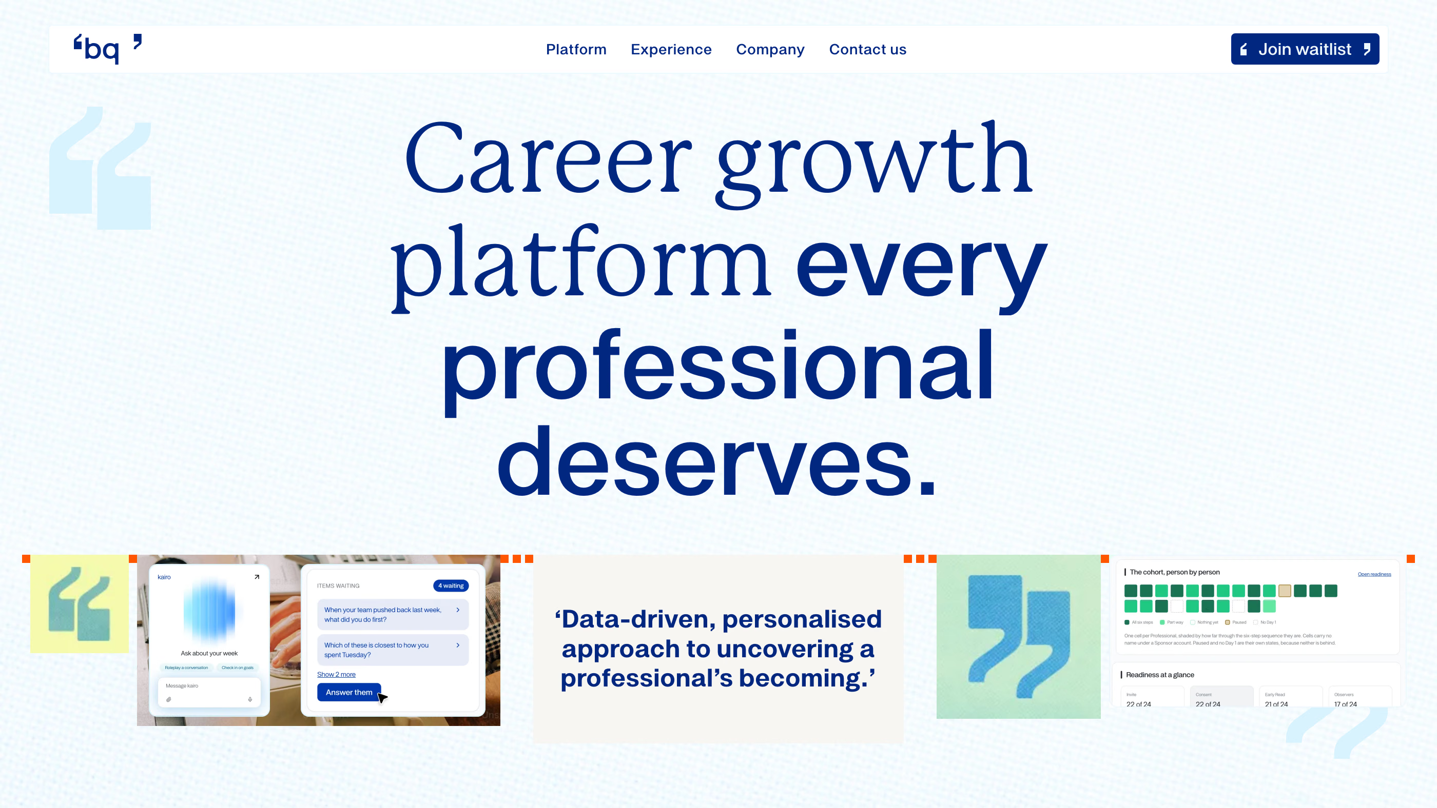
The website we designed and developed is live at becomingquotient.com, and the brand guidelines are published online. Engagement in progress.


What we built for Becoming Quotient
Three layers, built in order: the strategy that states what BQ believes, the verbal identity that sets how it speaks, and the visual identity that makes both recognisable. The full system lives in the brand guidelines.
Brand strategy
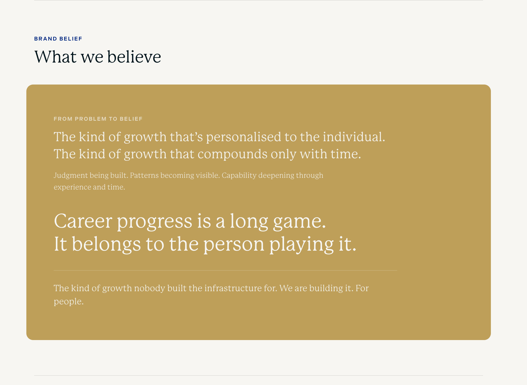
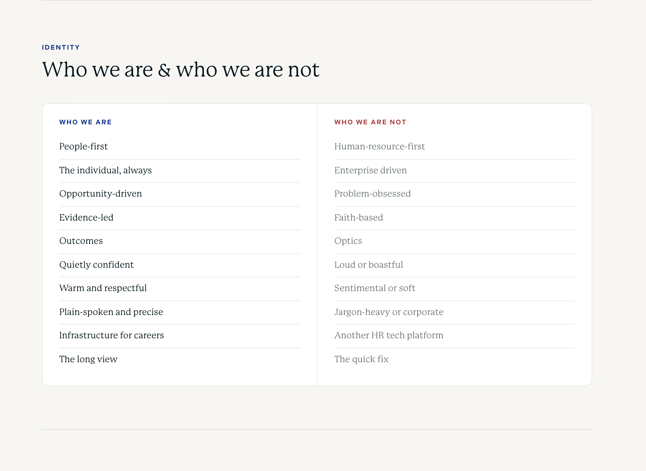
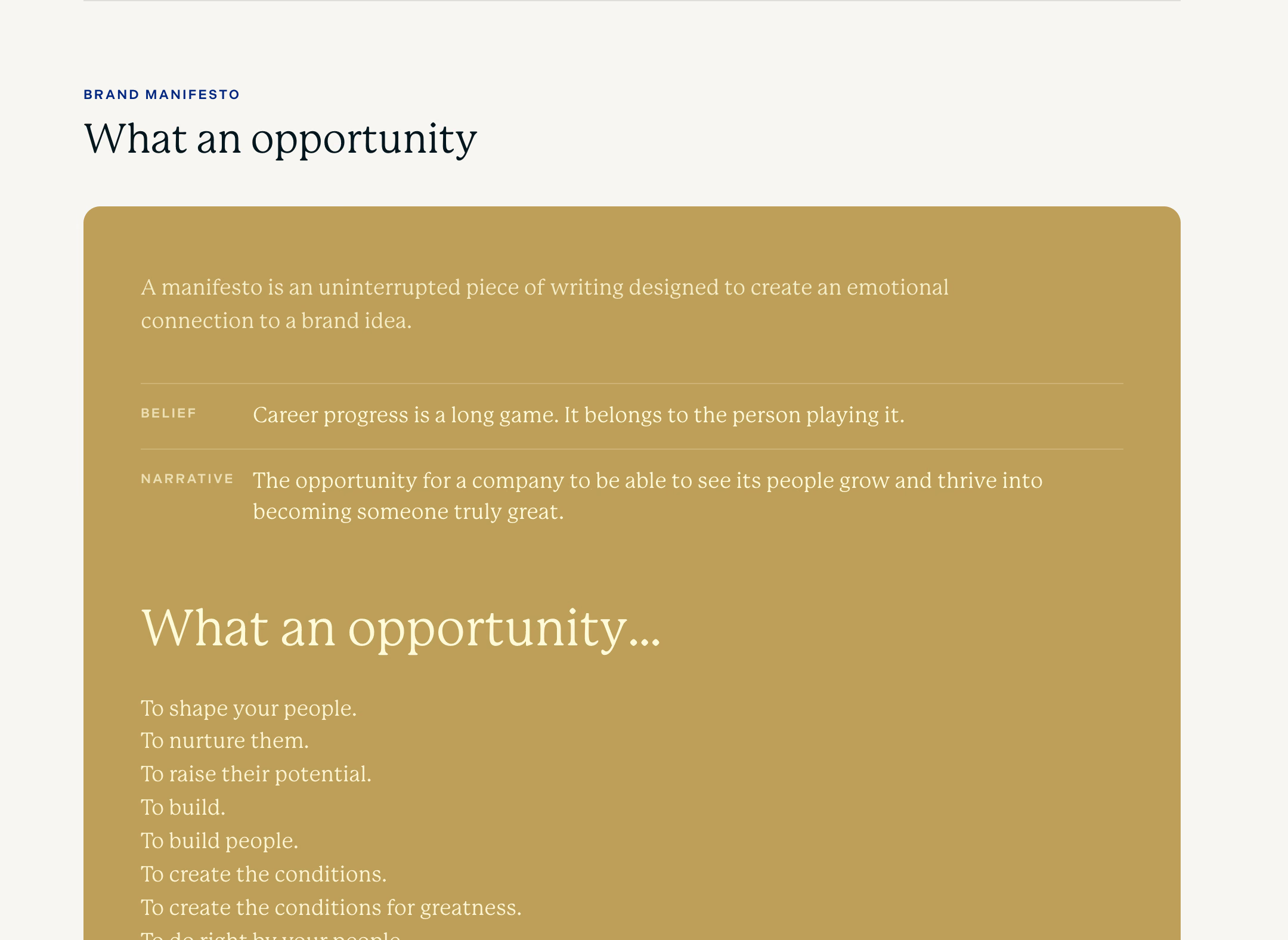
Everything starts from one belief: career progress is a long game, and it belongs to the person playing it. From it came the purpose, “We exist to make human growth the greatest opportunity of our time”, the vision and mission, a clear line on who BQ is and is not, and the manifesto, “What an opportunity”.

Verbal identity
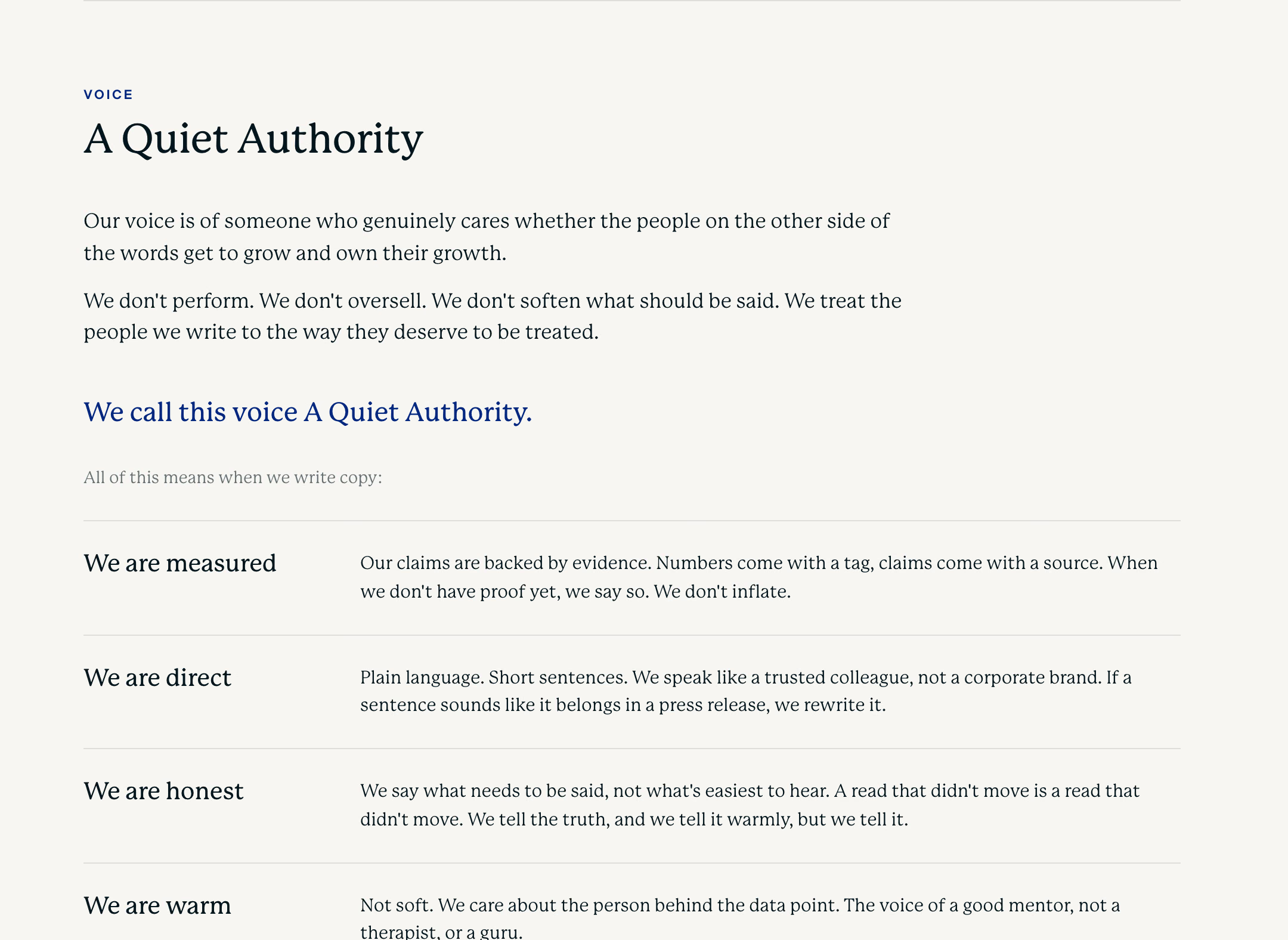
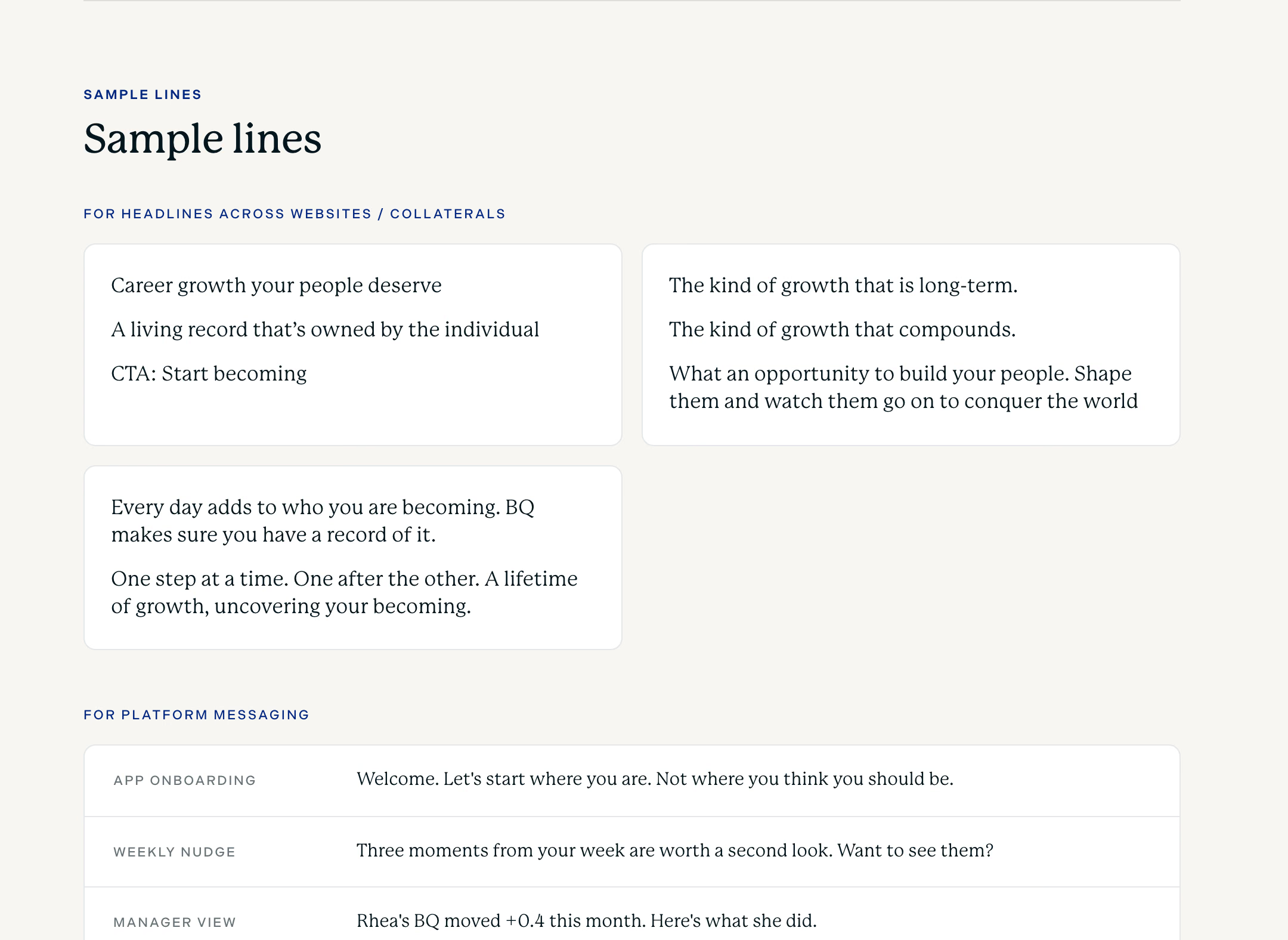
A voice called Quiet Authority: measured, direct, honest and warm. The guidelines carry sample lines for websites and the product, the words that are home to BQ, and microcopy down to button labels.
Visual identity
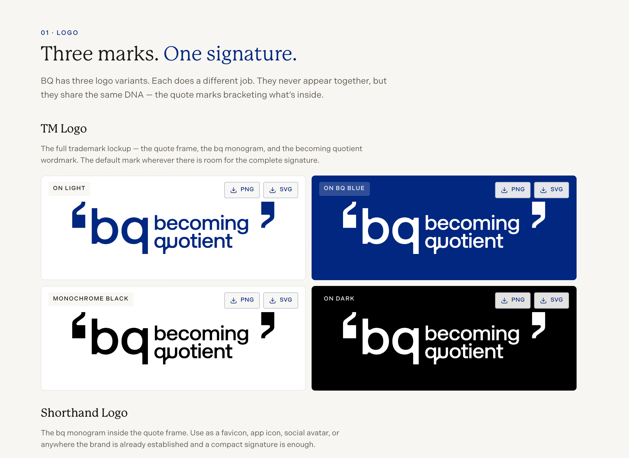
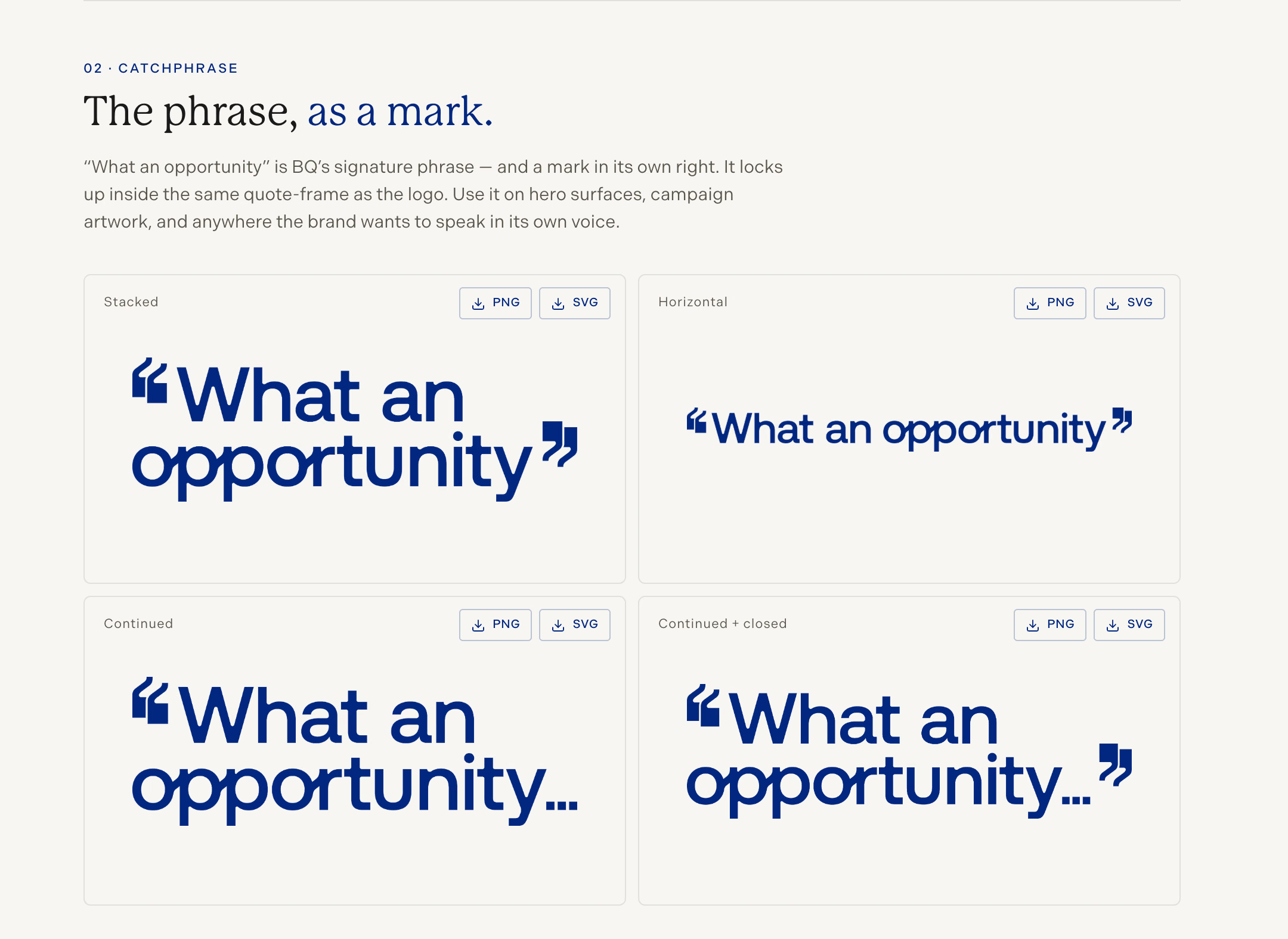
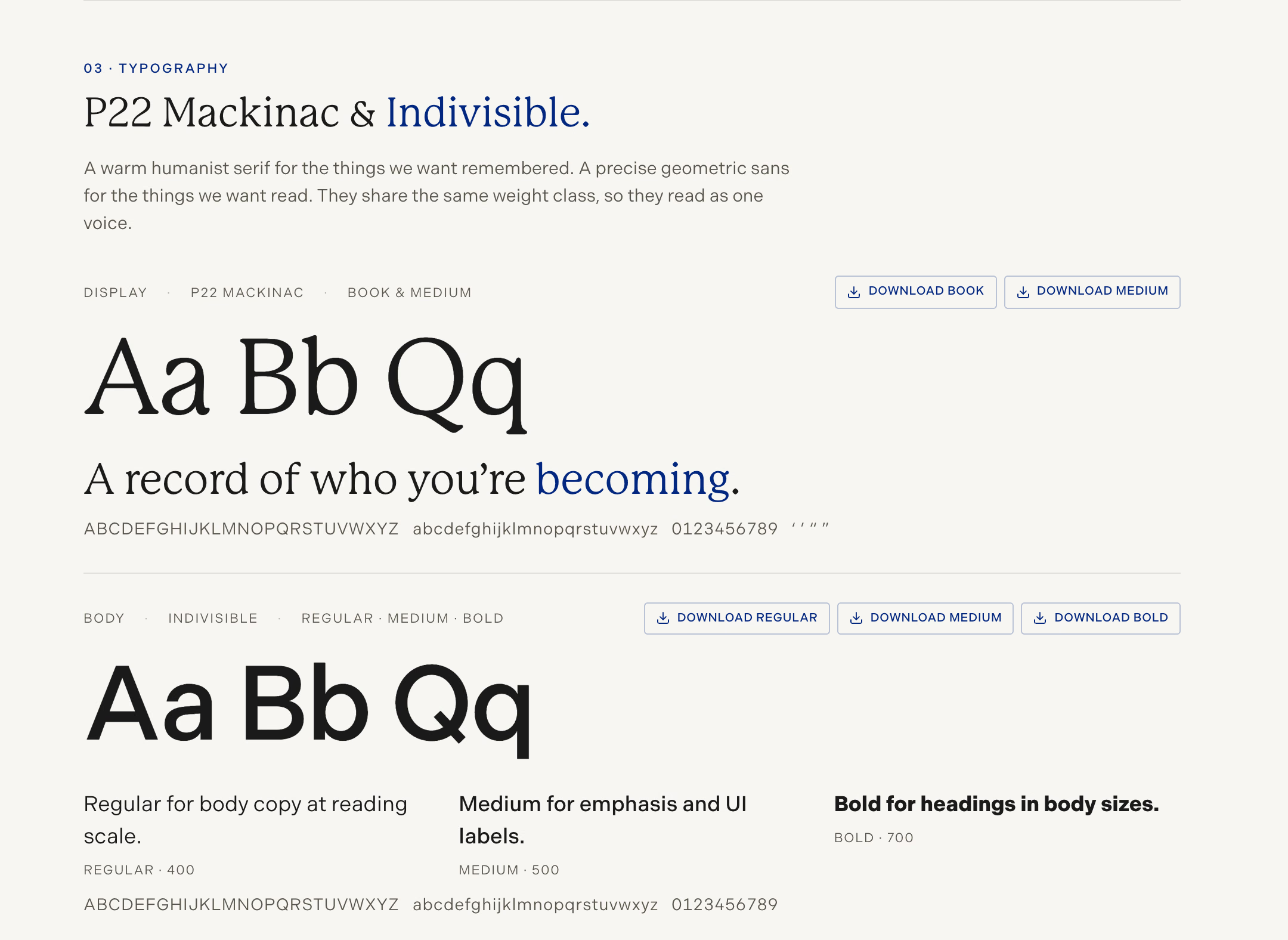
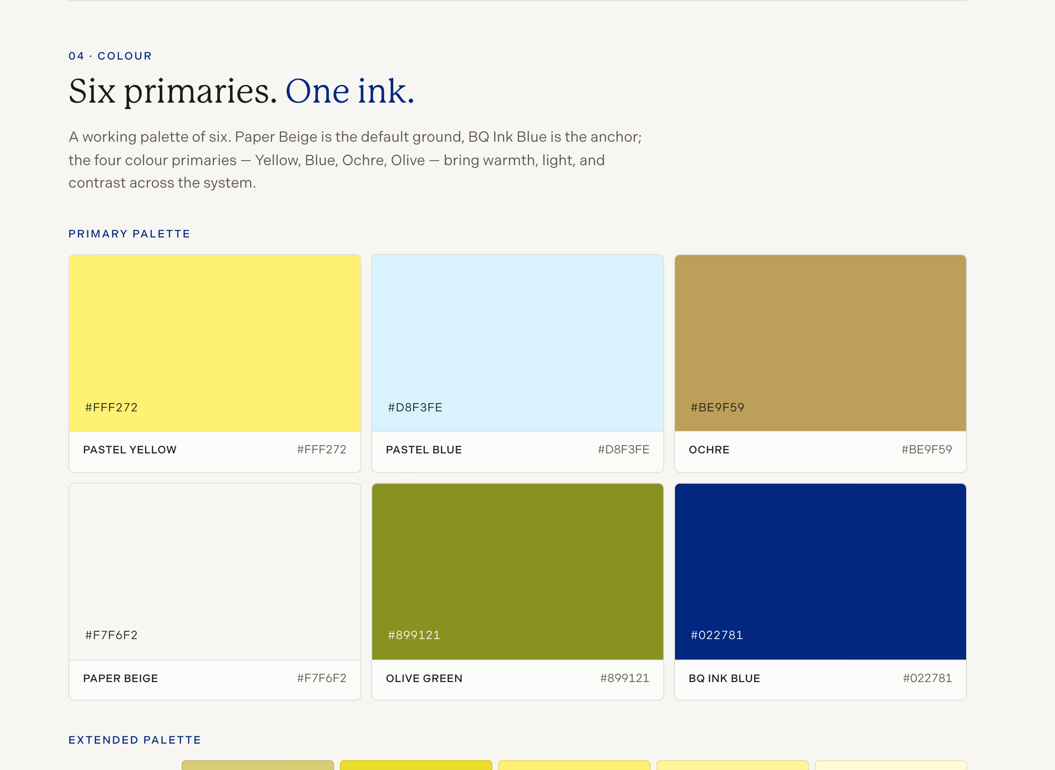
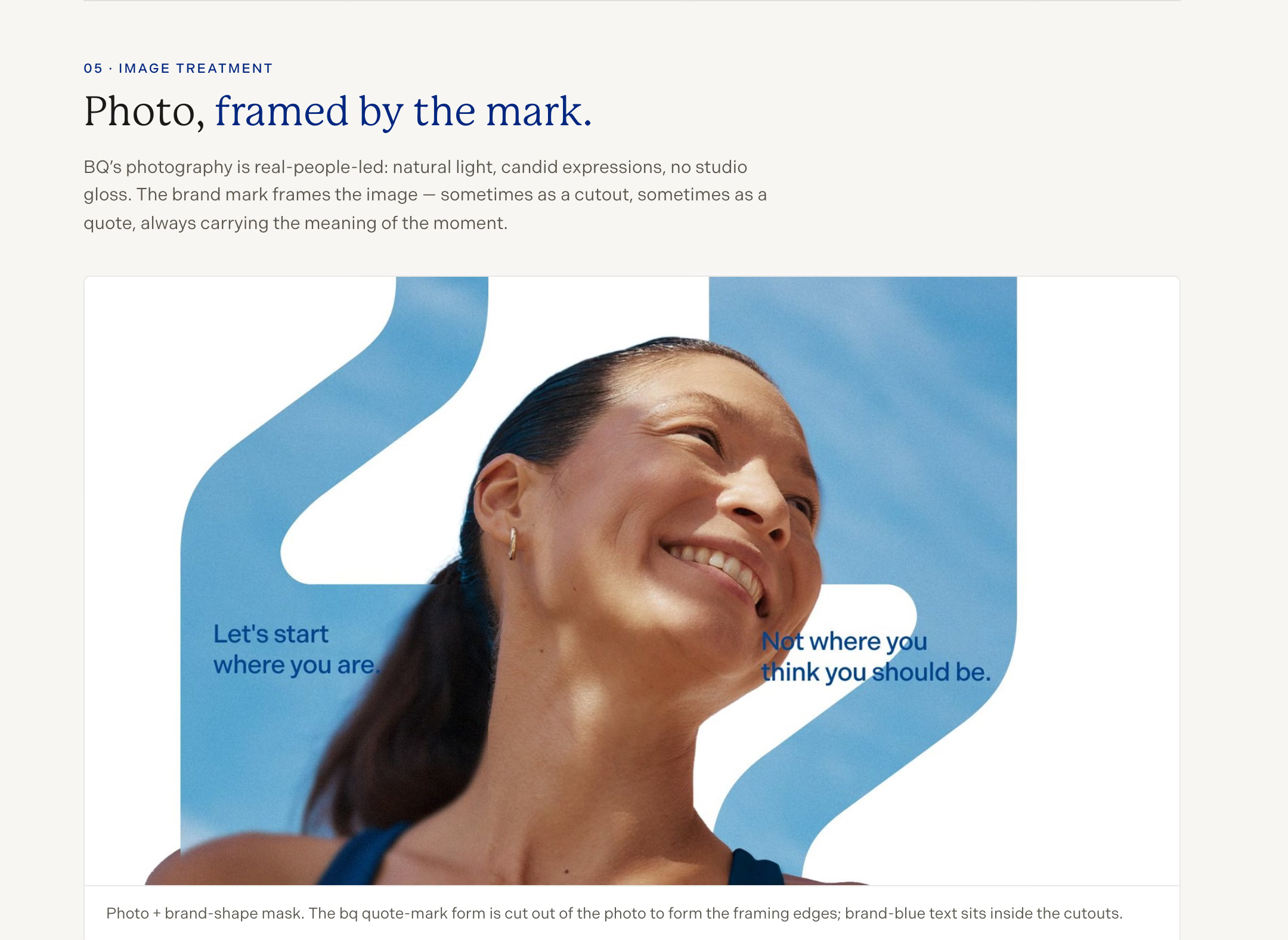
Three logo marks share one signature: the quote marks that bracket what is inside. The catchphrase became a mark in its own right. P22 Mackinac and Indivisible set the type, six primaries set the colour, and the photography is framed by the mark.
Project Team
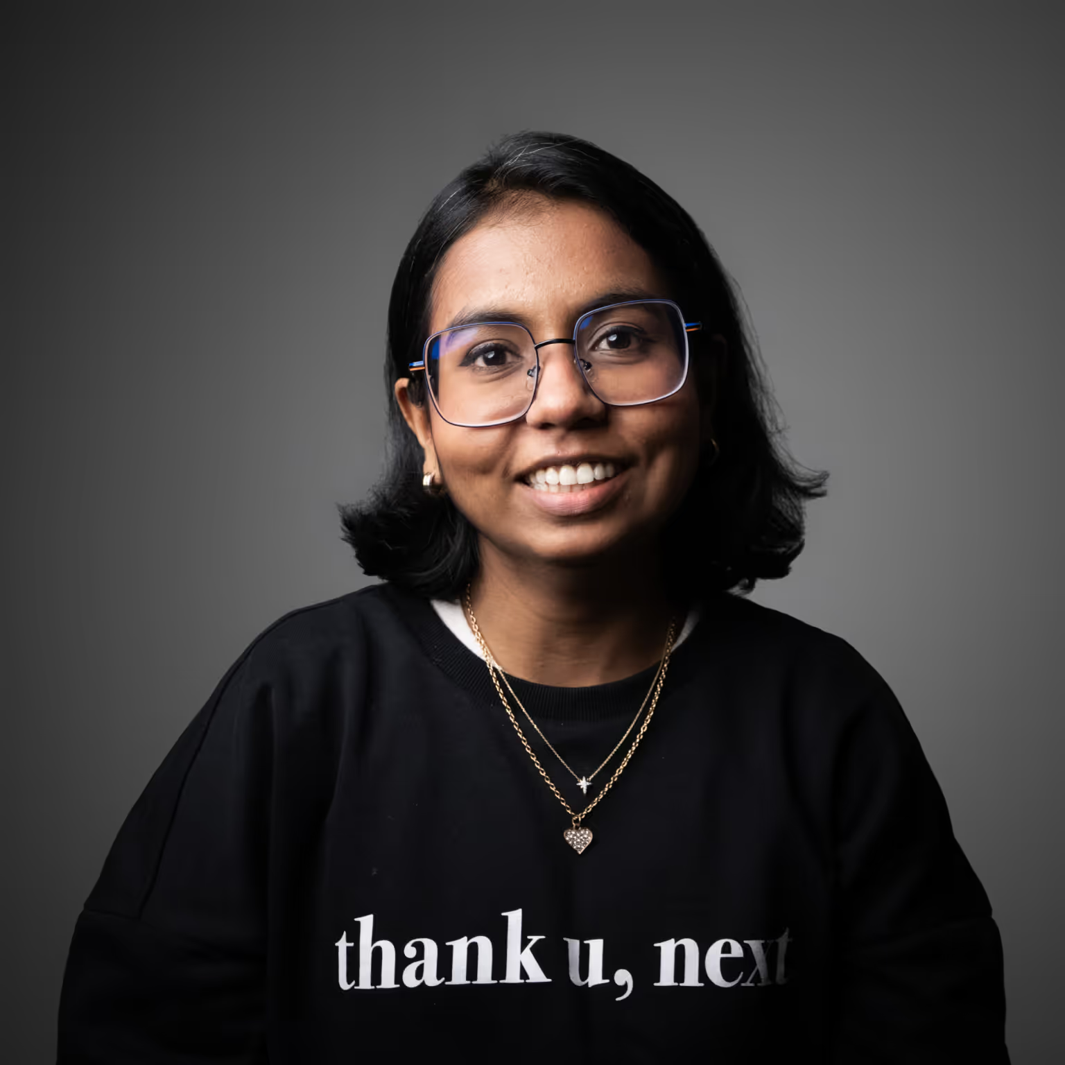
Sanjana Hmath
Lead Designer

Ekta Manchanda
Co-Founder | Principal Designer
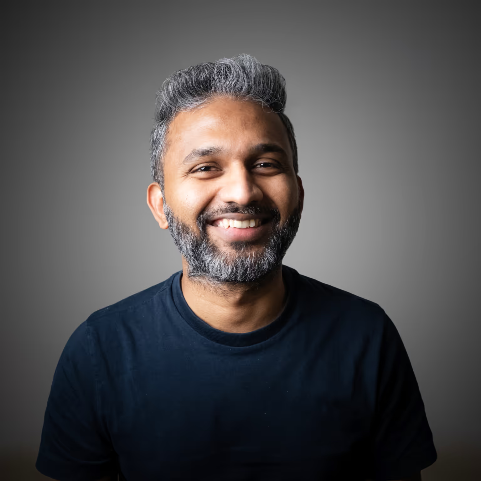
Mejo Kuriachan
CEO | Partner | Brand Strategist
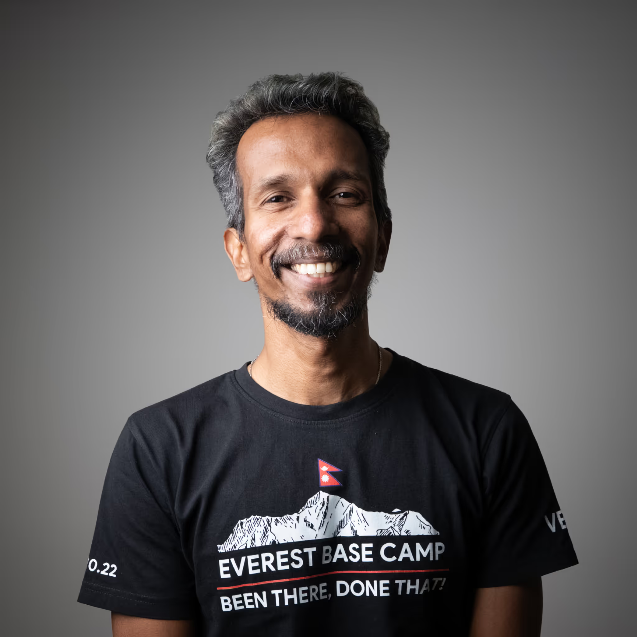
Sijeesh VB
Lead Strategist
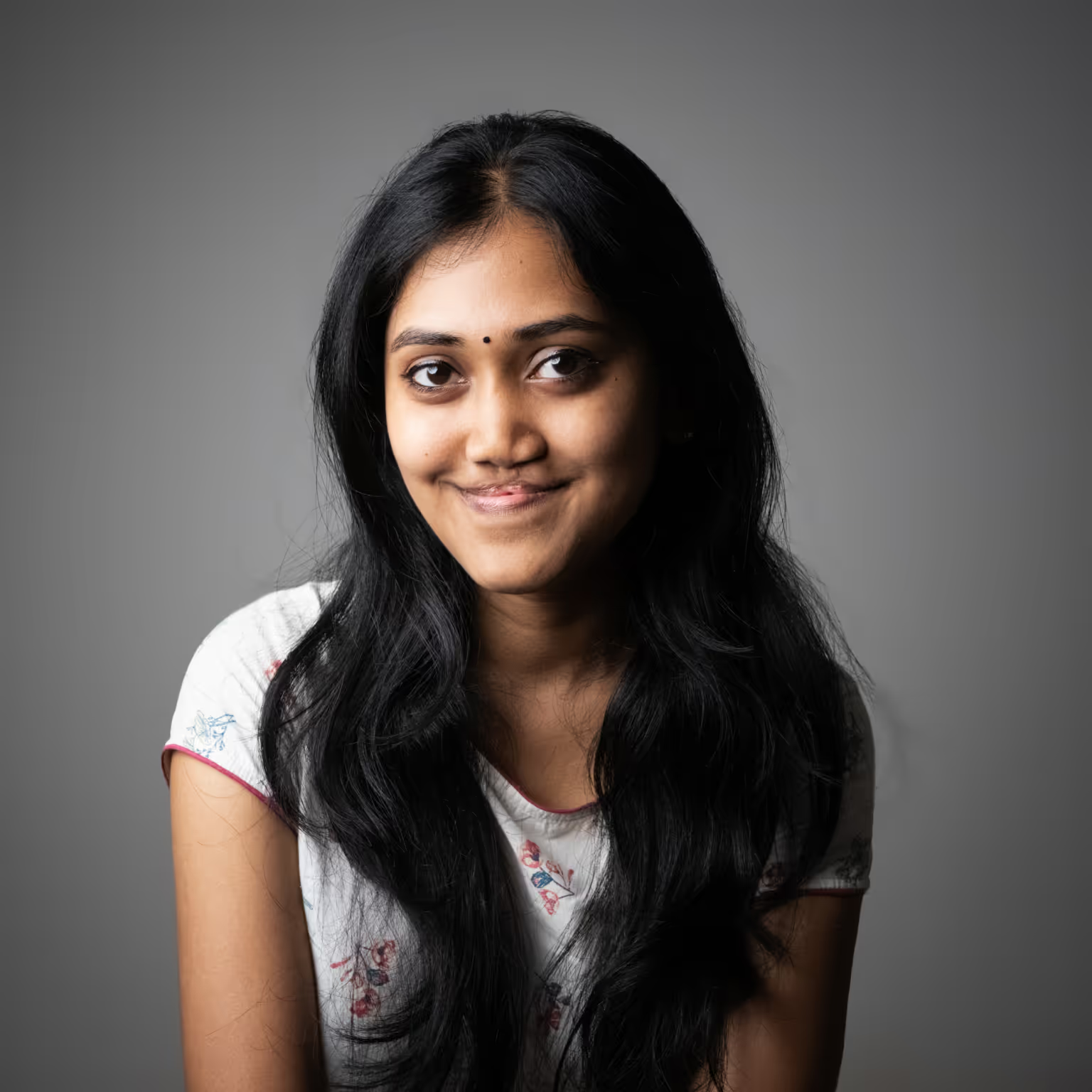
Swathi Mohan
Content Strategist

Arpan Sen
Chief of Staff | Project Manager
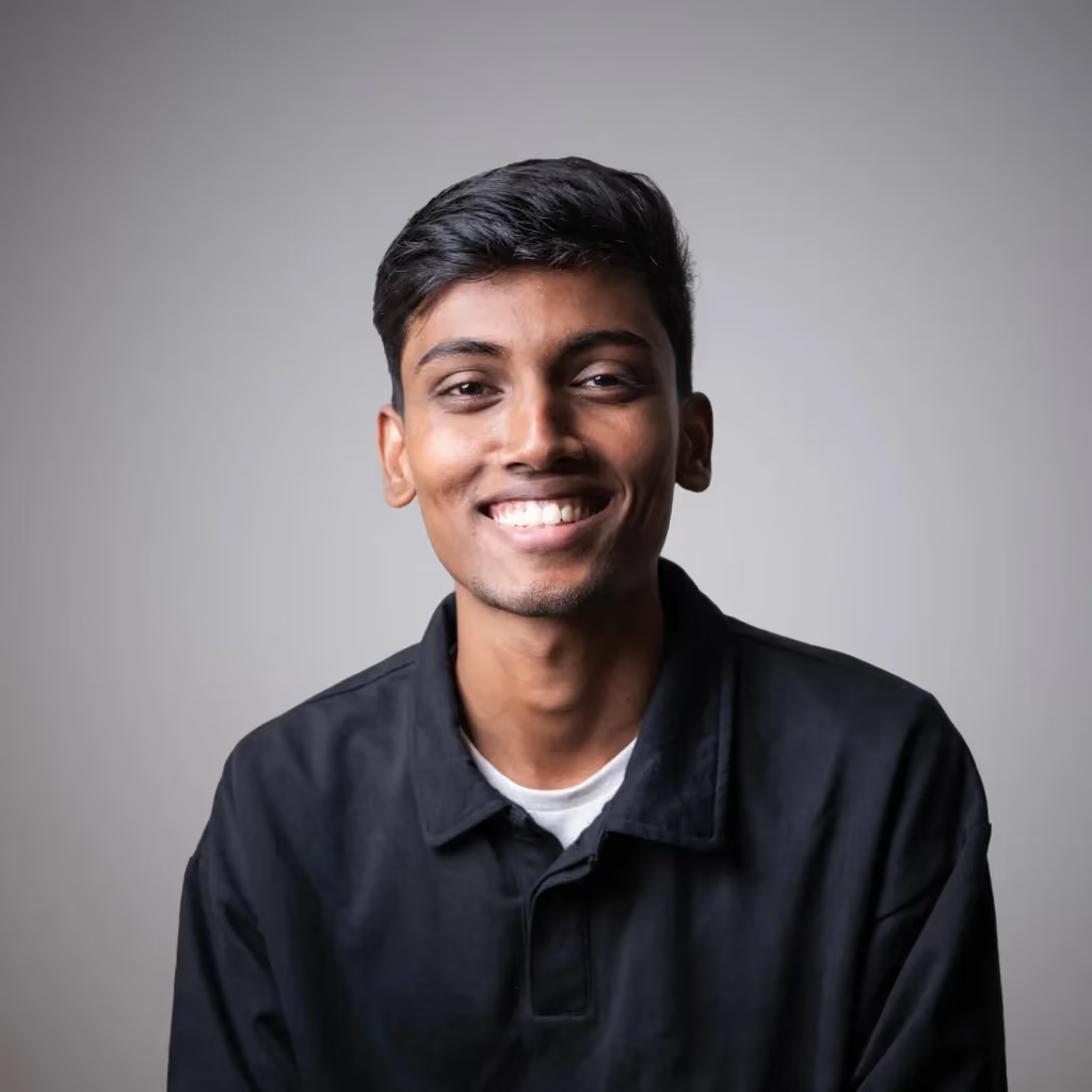
Mithesh Dhariwal
Design Management Intern
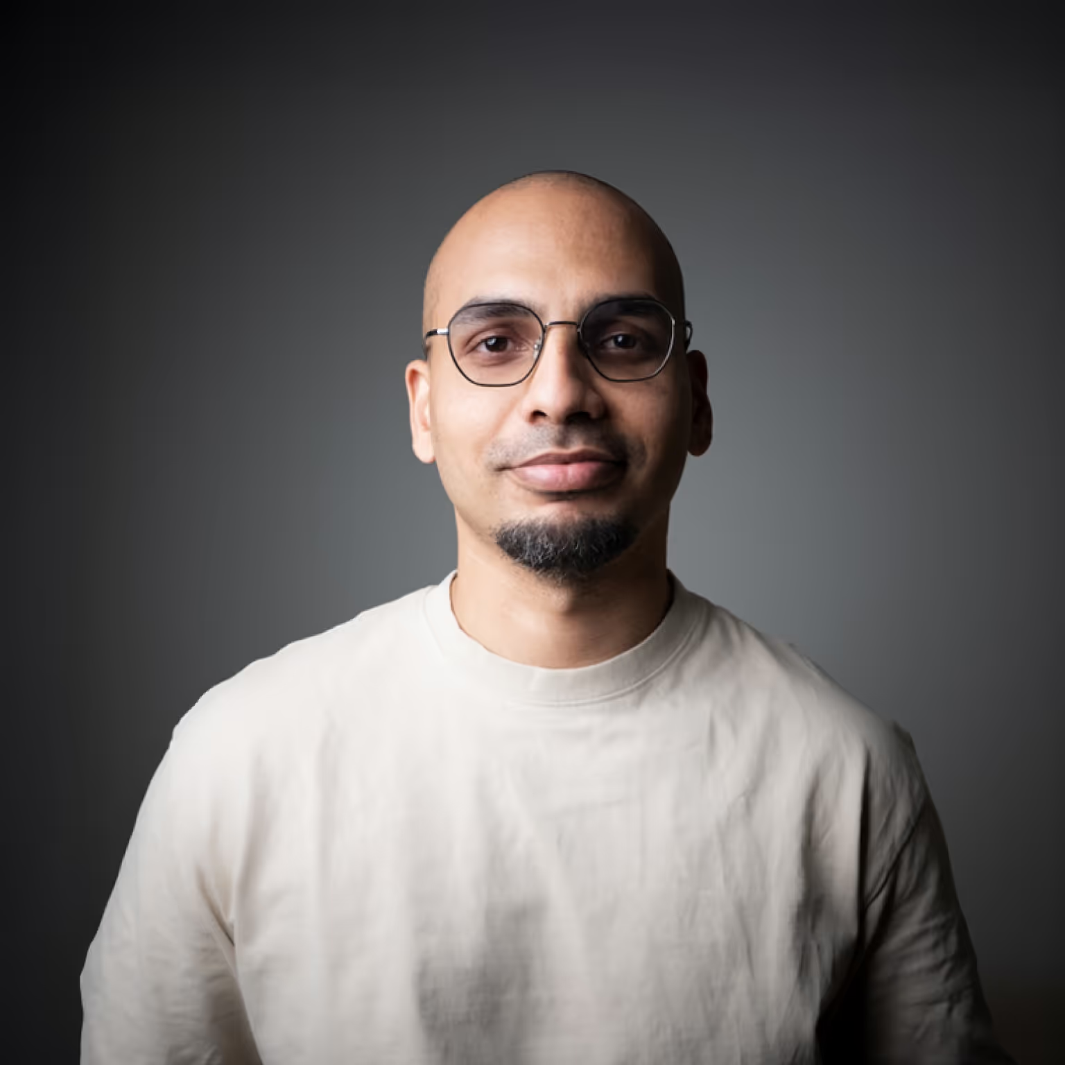
Tejus Yakhob
Creative Director - Film Production
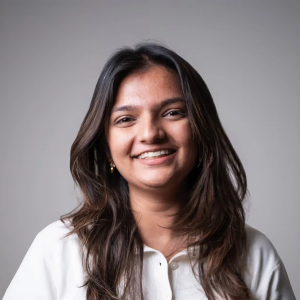
Mehak Dhruv
Designer
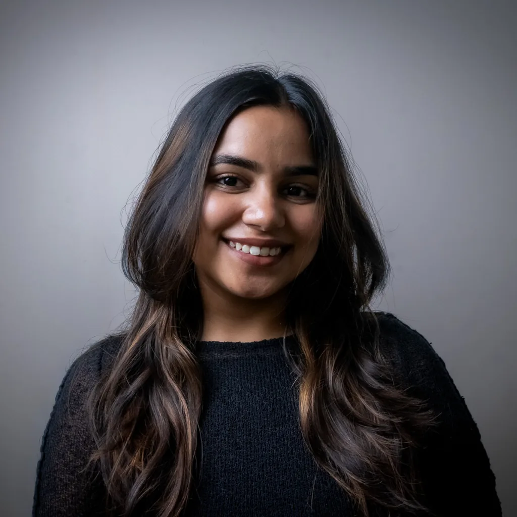
Samiksha Somani
Designer
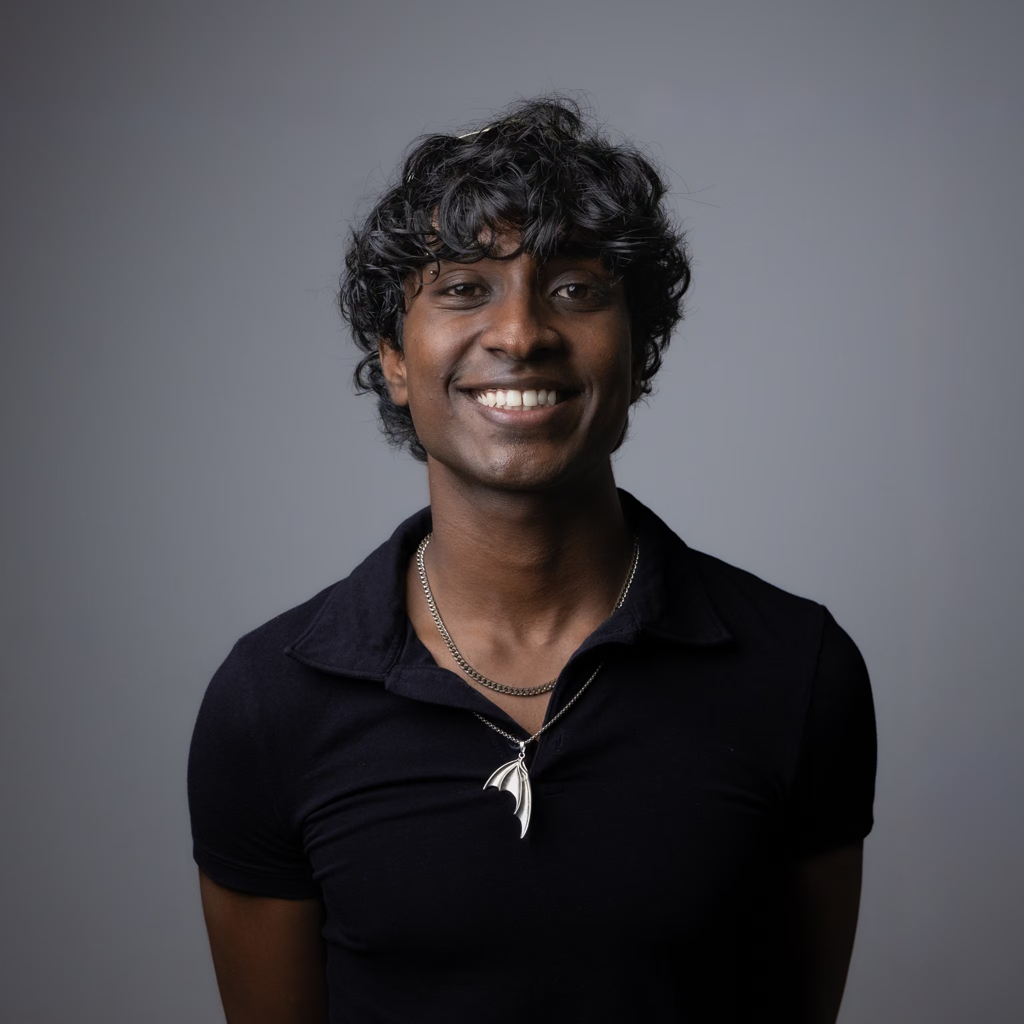
Ashik Arul Clement
Motion Designer

Prashasti Ranjan
Partner | Design Strategy